Project Time:
4 weeks
1. Idea
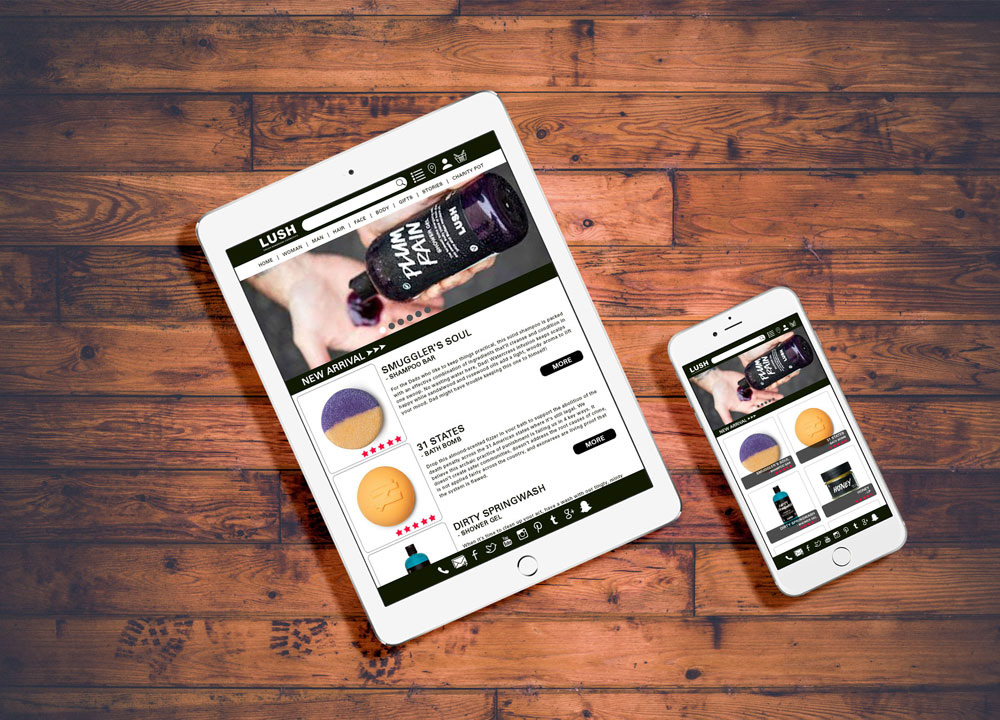
Lush is a very good brand but the website is hard to use. From Layout, navigation bar to product introduction. It looks very messy. As my favorite brand, I was thinking to redesign its three pages - category page of new products, product page, and checkout page in two visions(Mobile & Tablet).
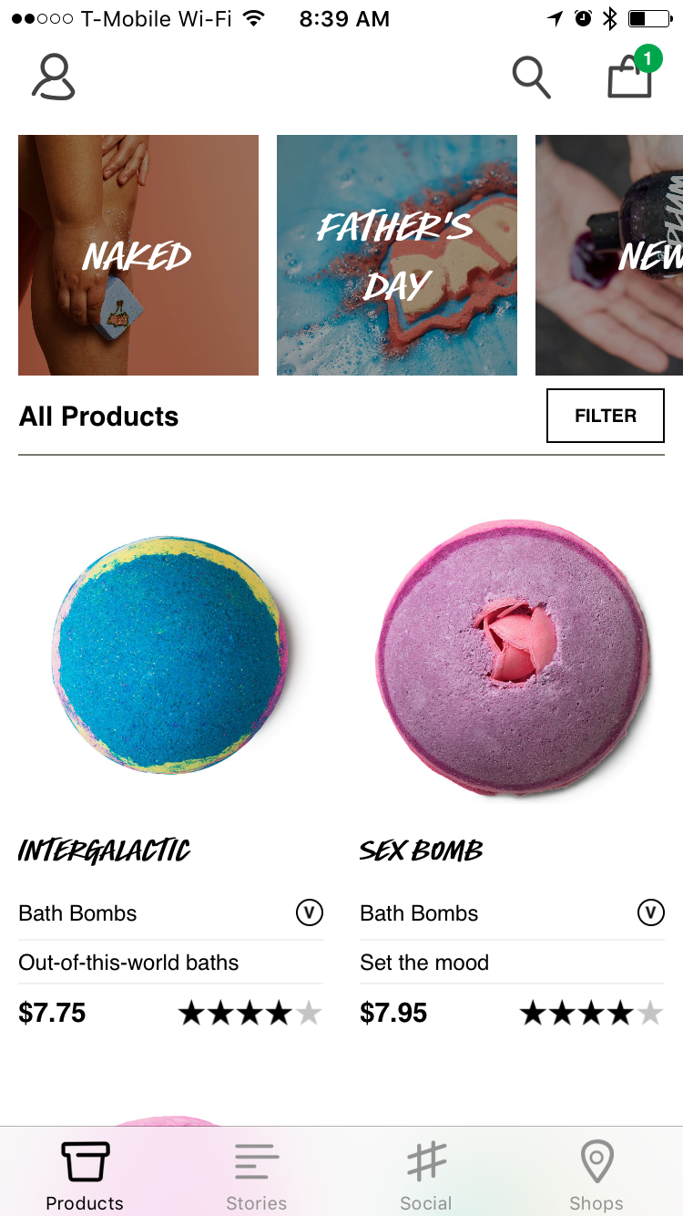
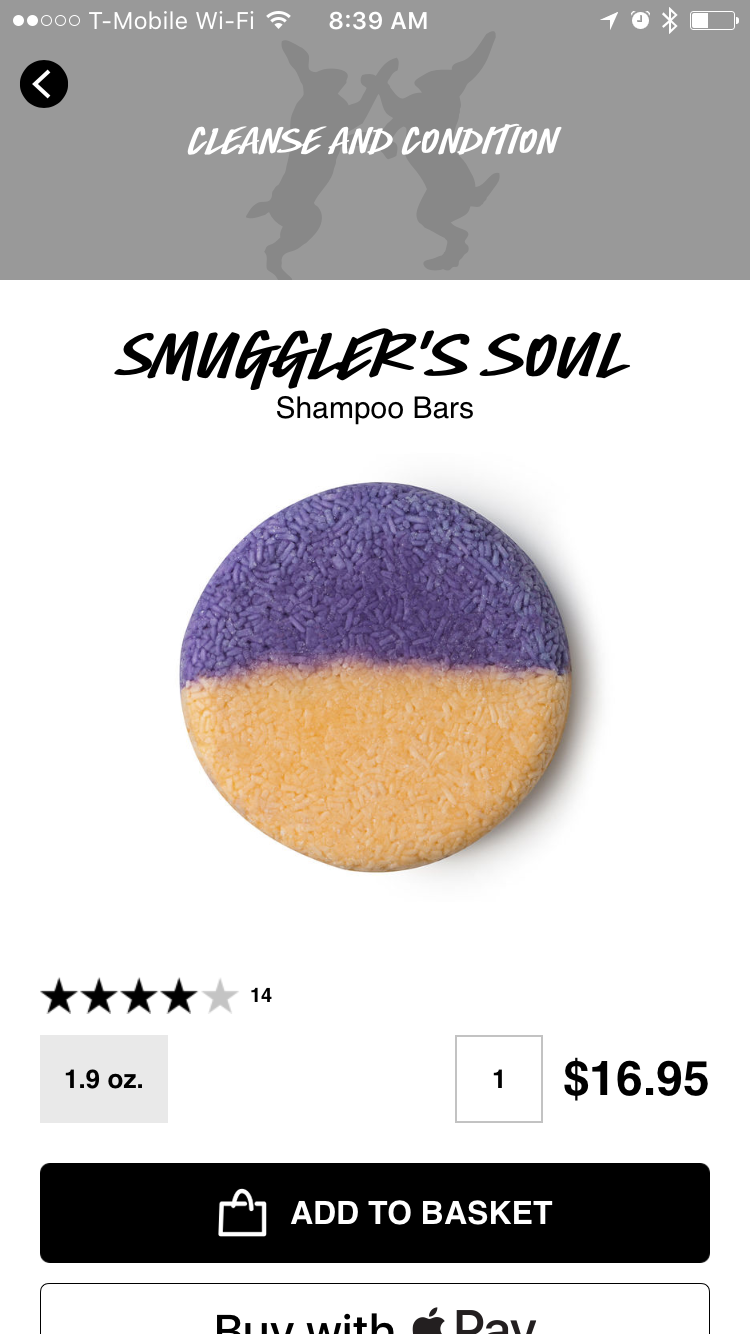
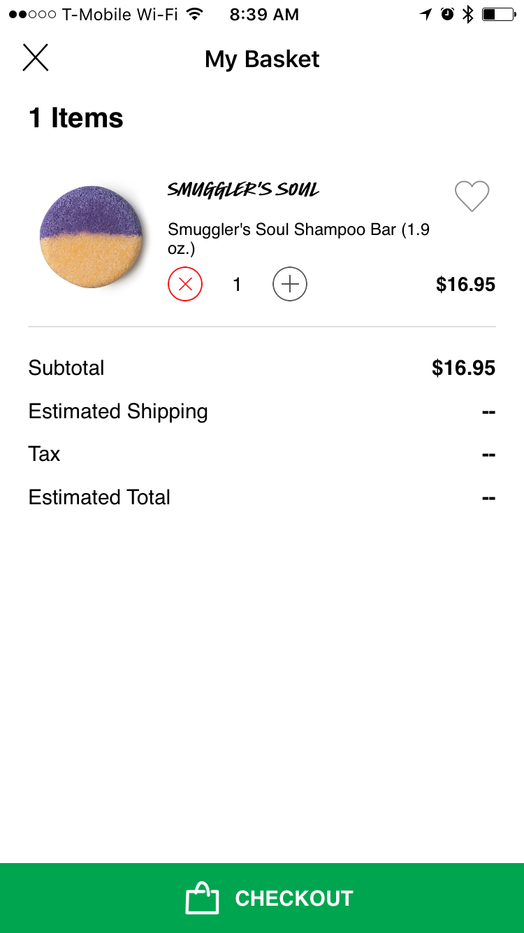
The Original Page
The Problem for Original Vision
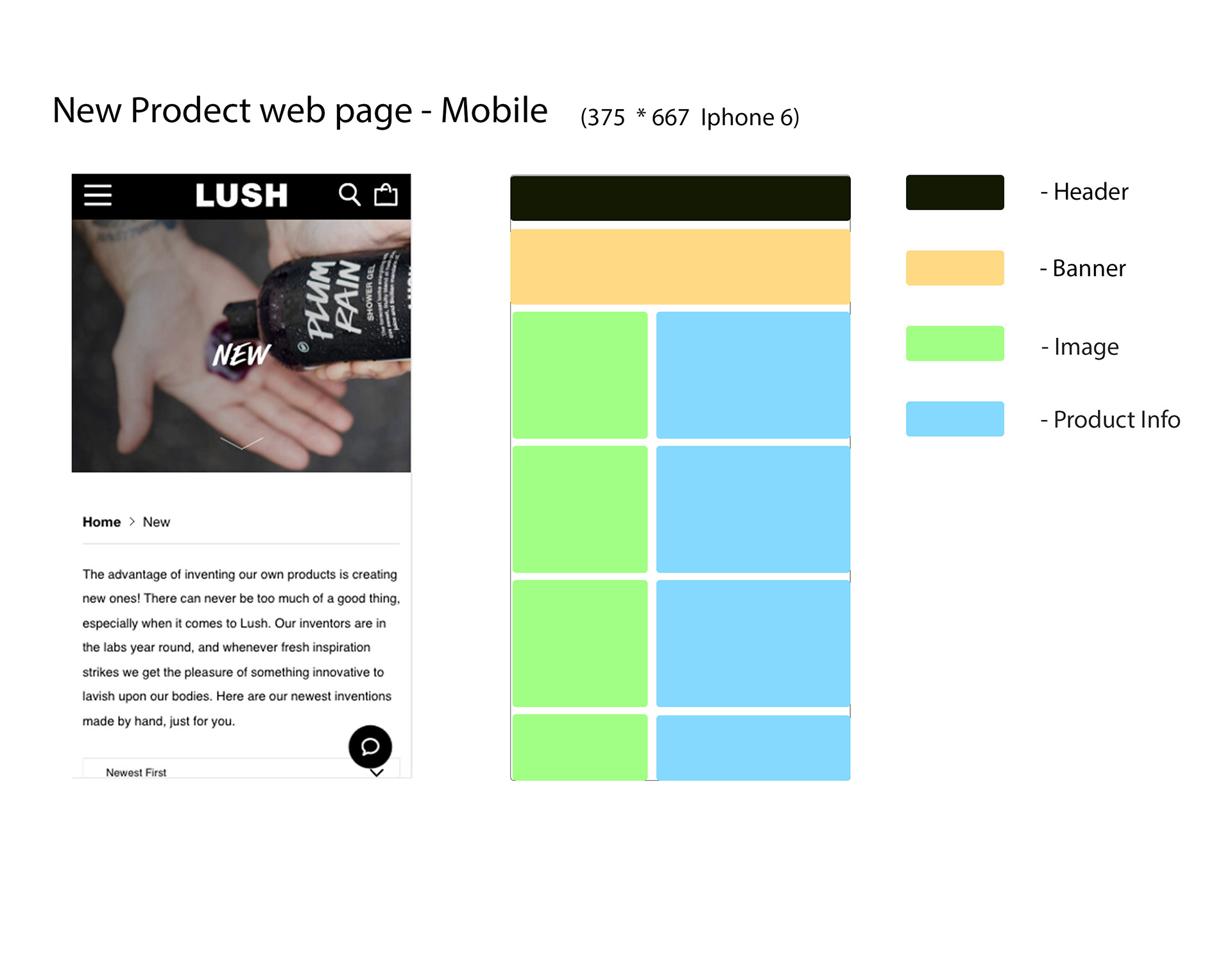
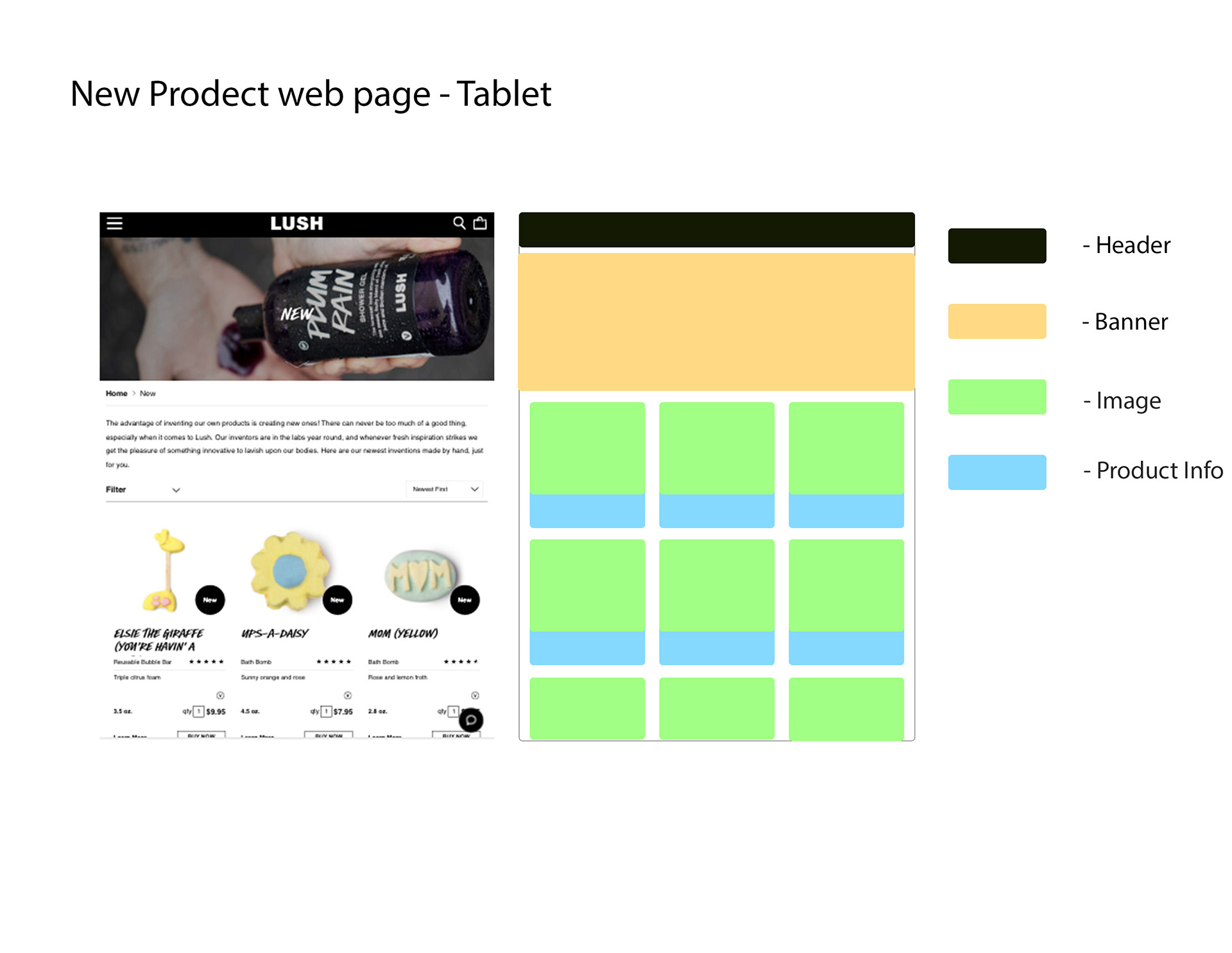
I. Category Page
a. It has no navigation bar and not good to use.
b. It wastes a good space on the header bar.
c. Banner part is bad of setting marketing part.
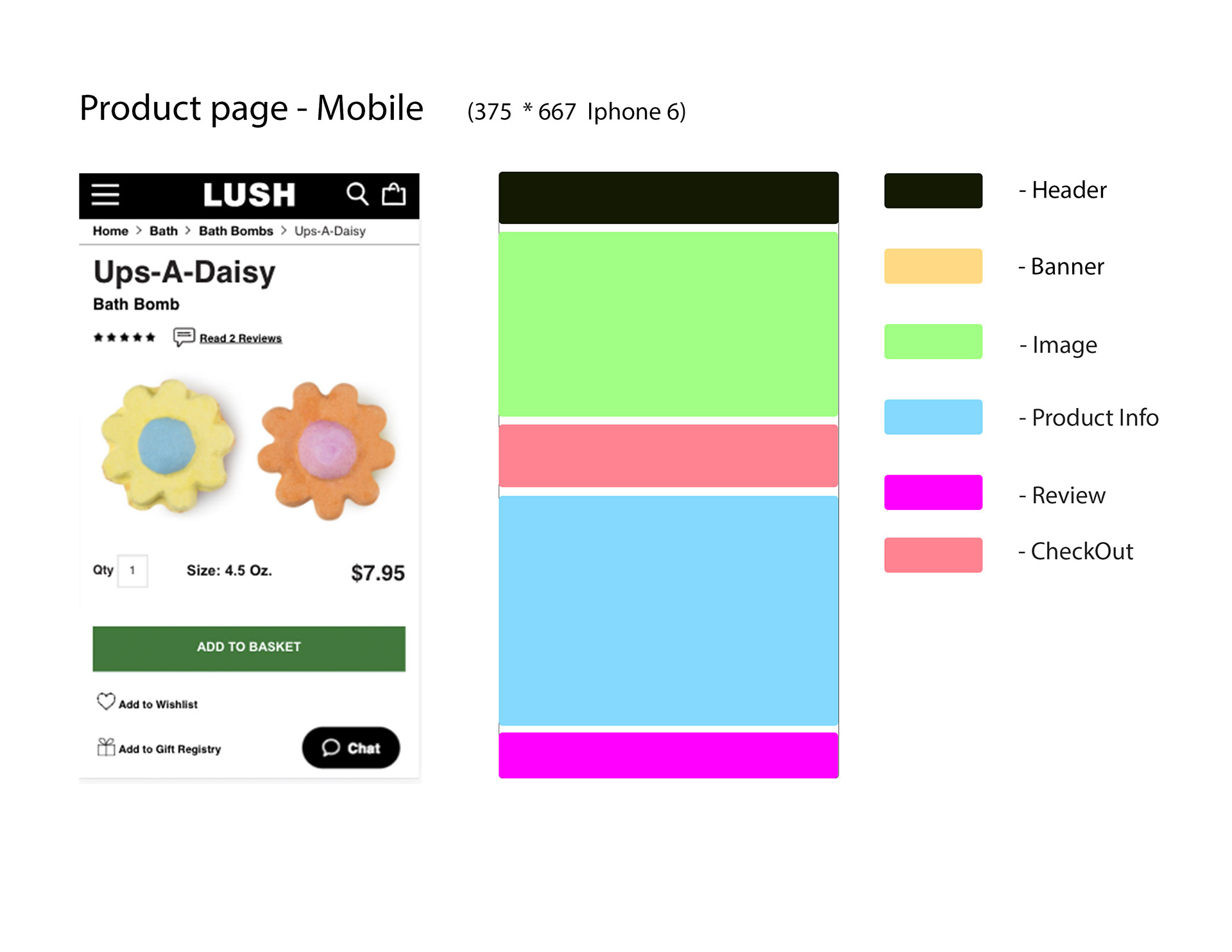
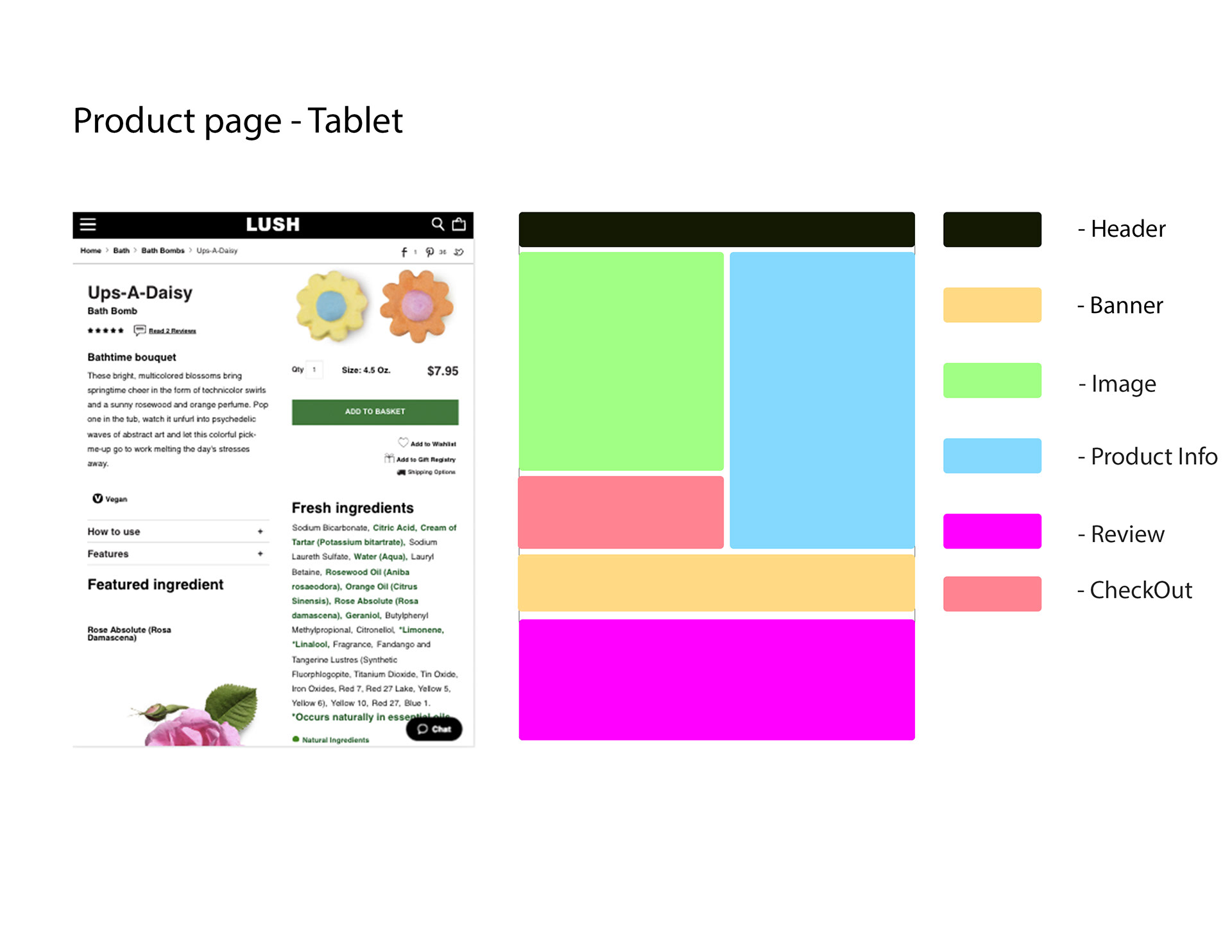
II. Product Page
a. The font is hard to read as a name.
b. Nothing is on banner, waste space.
c. Less image for details. It is bad for catch user attention.
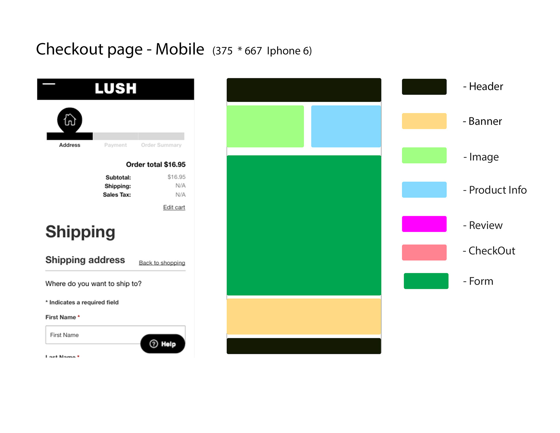
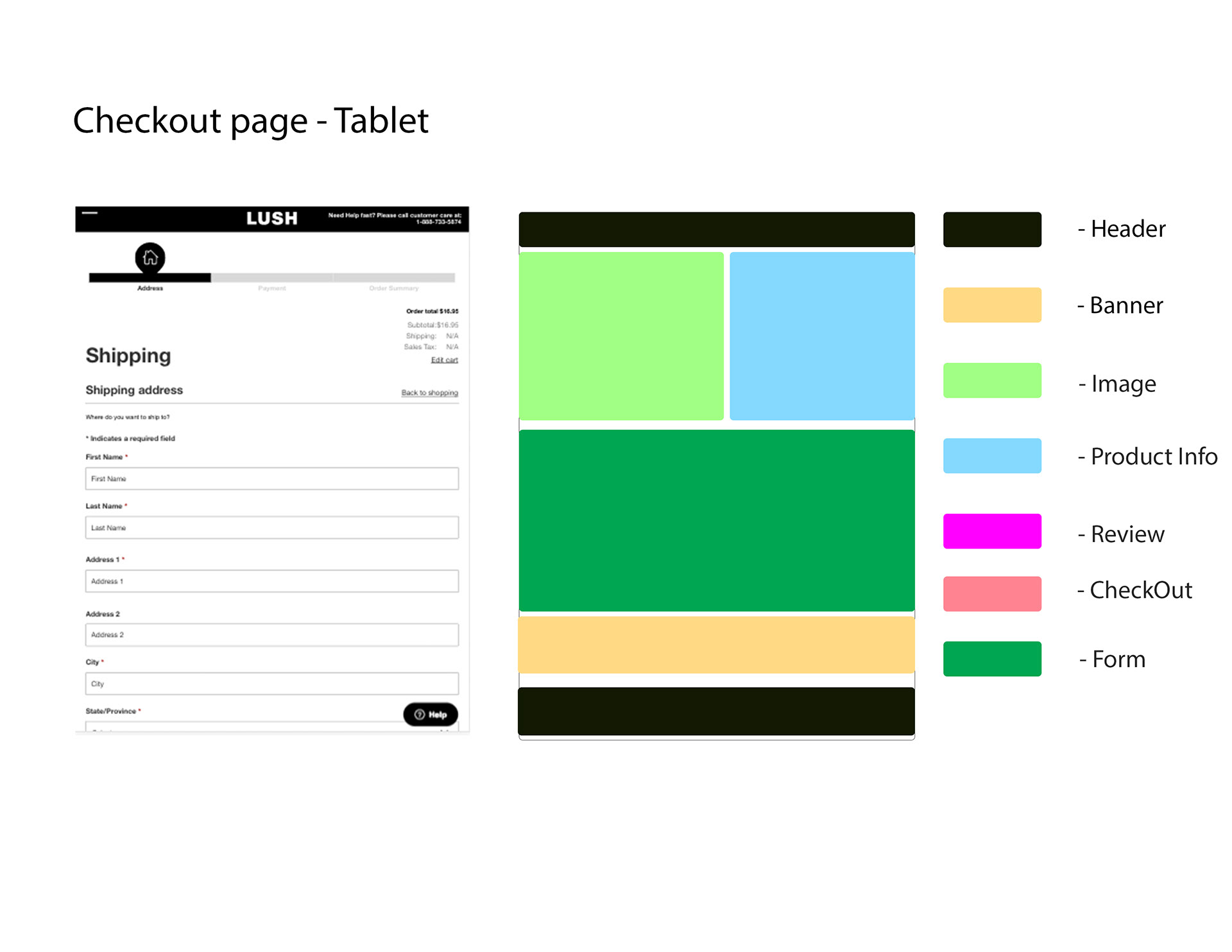
III. Check out Page
a. Check out page is not organized.
b. it doesn't give users an opportunity to edit shopping basket.
c. The website has the description about the shopping basket but It shows the case icon instead of basket icon. It is not consistency.
Those problems will be solved in my project.
2. Competitive Audit
I picked the several similar Makeup brand website to compare their usability.
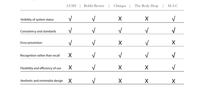
To compare another brand's vision. Lush needs some improvement.
3. Workflow
After understanding the direction of the design. I start to make workflows to clear my mind.
I. Mobile Vision Workflow
II. Tablet Vision Workflow
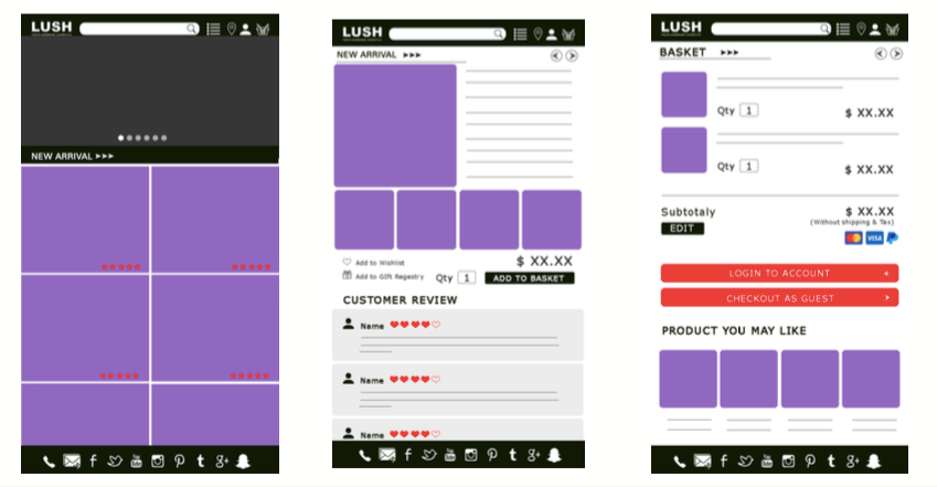
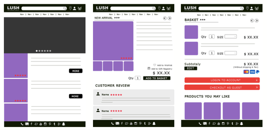
4. Wireframes
After I have a basic idea, I create the wireframes for each of the visions of pages.
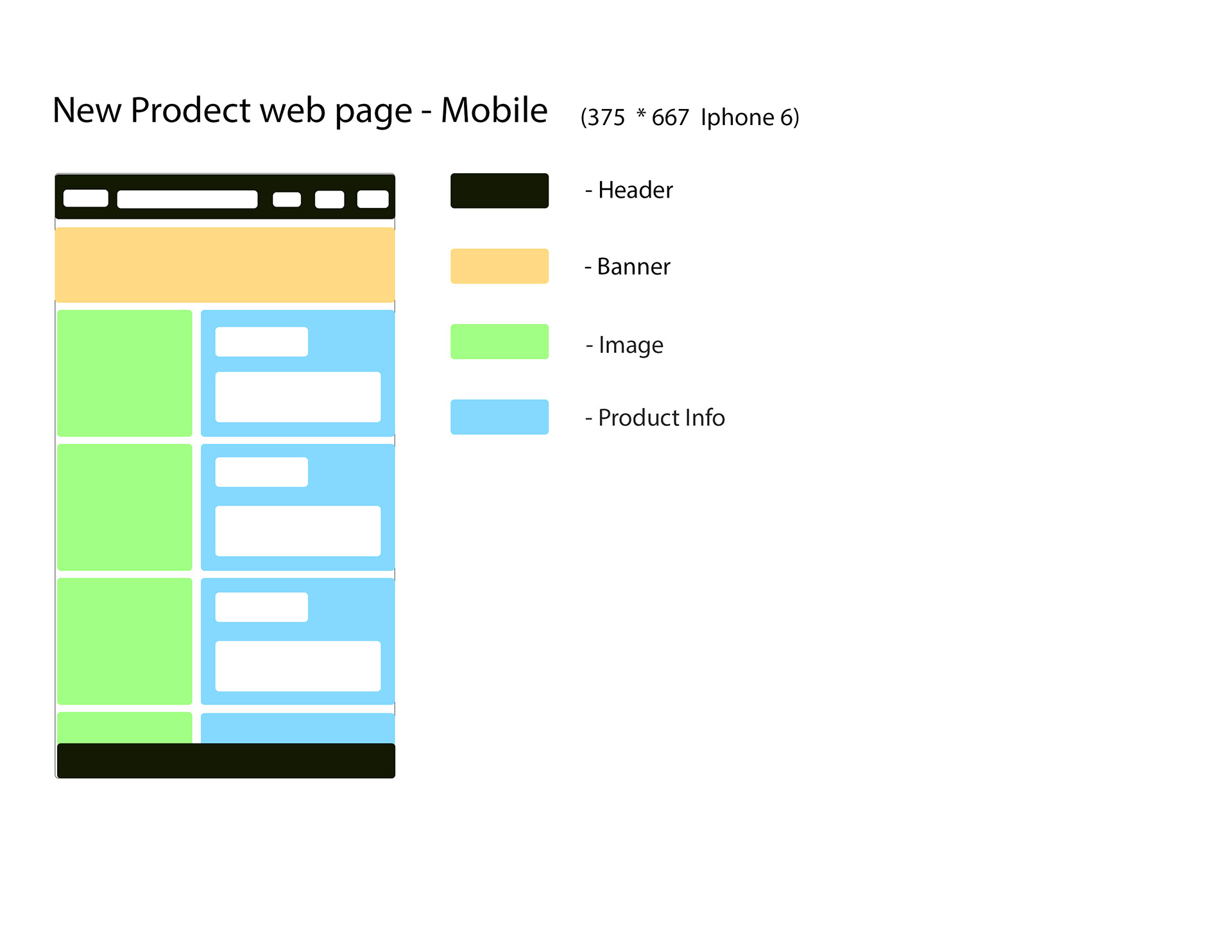
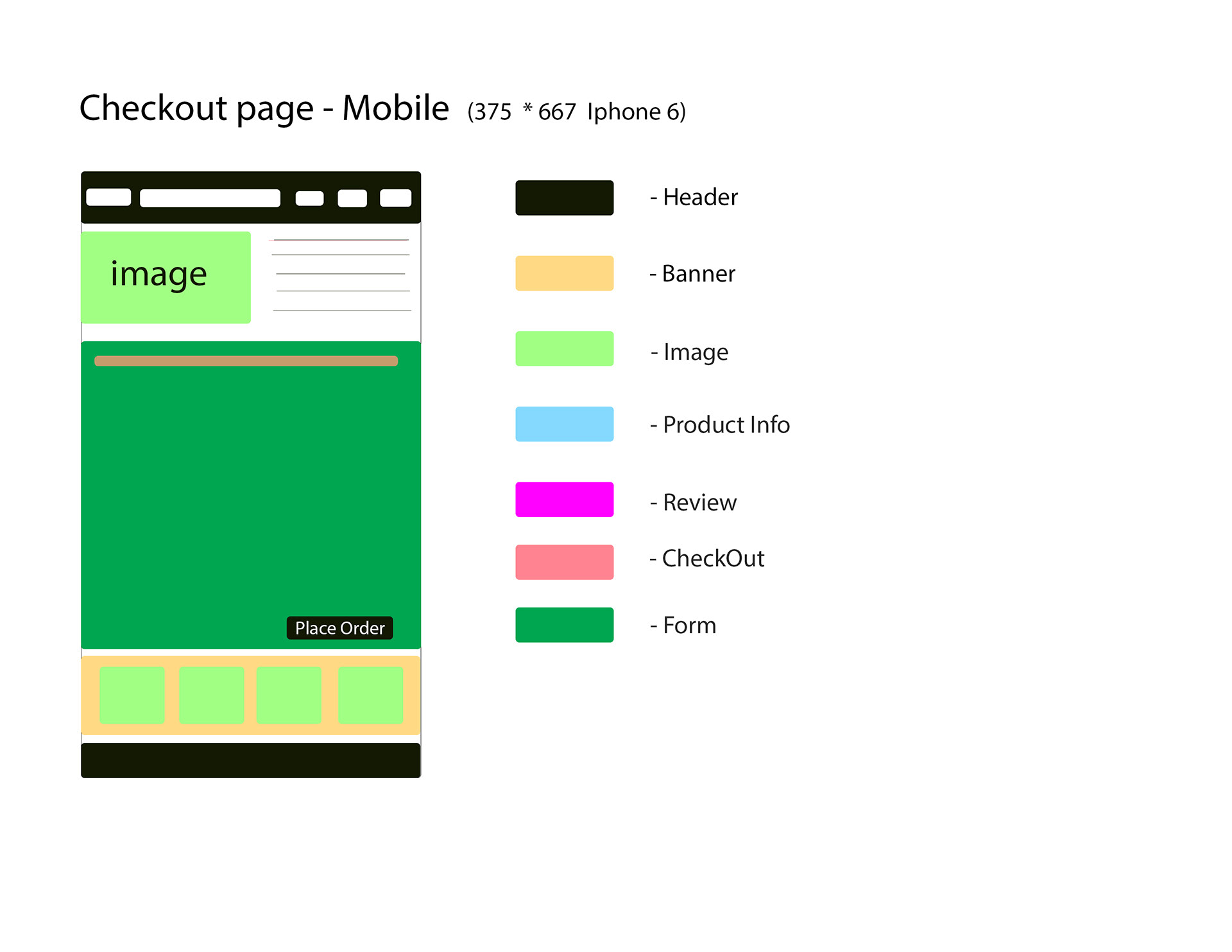
I. Mobile Vision Wireframes
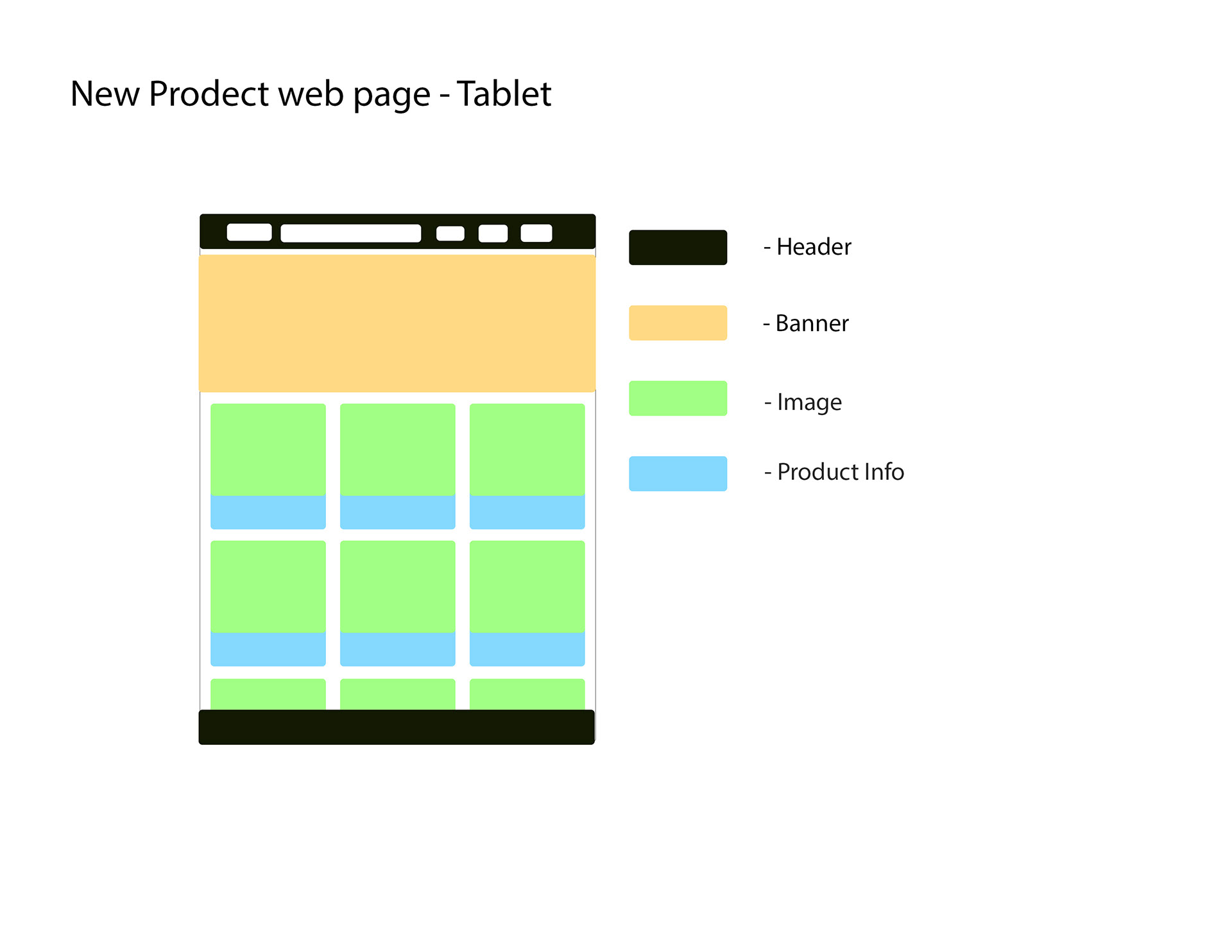
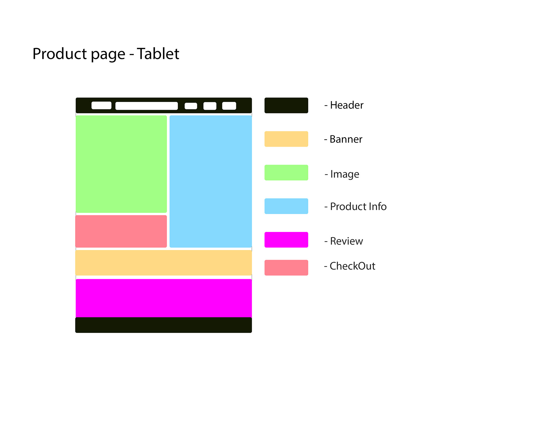
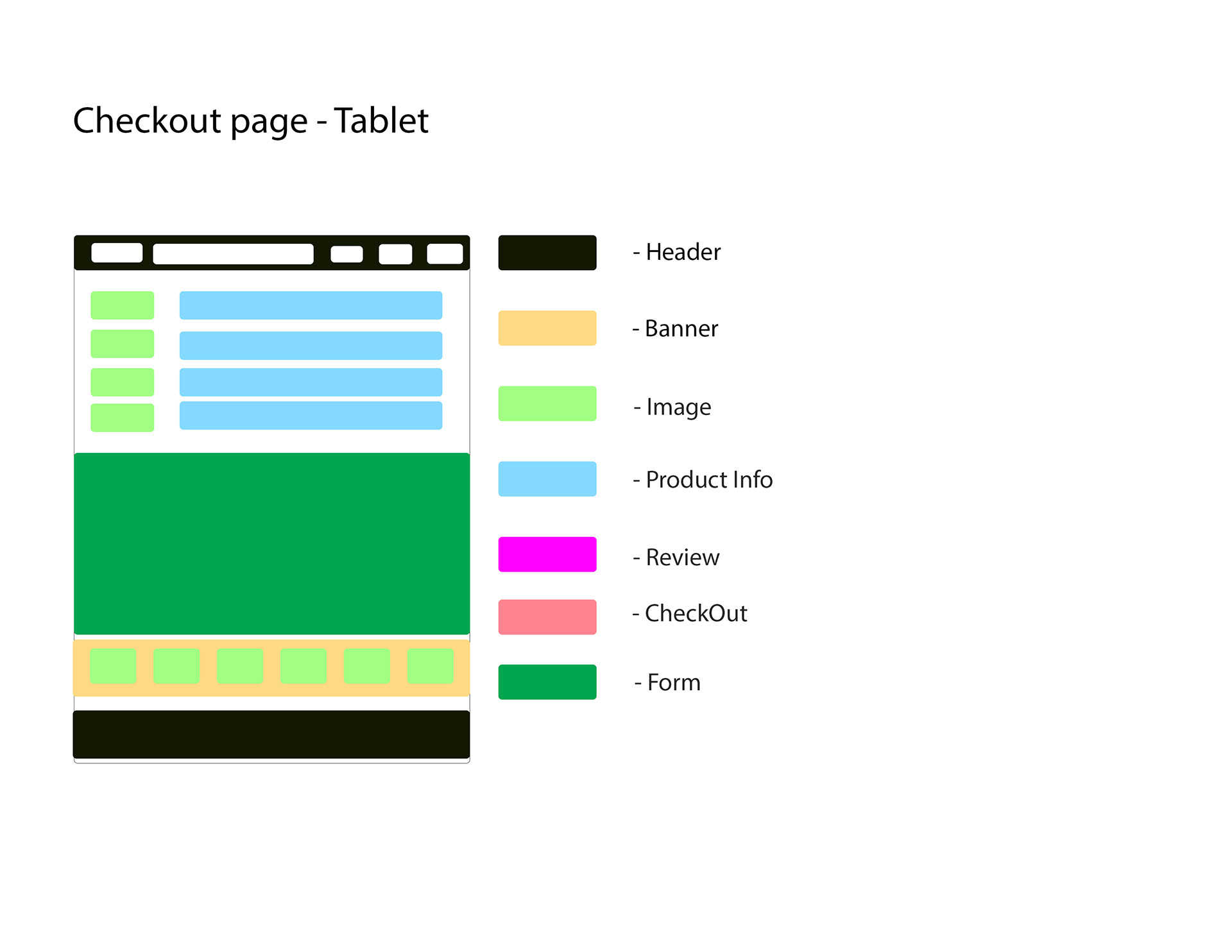
II. Tablet Vision Wireframes
When I do the wireframes, more and more idea comes to me. I got several options for each of pages. It is a good part of deign. It is a start for A/B Testing.
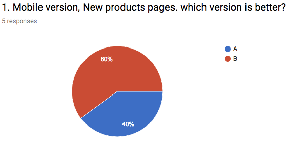
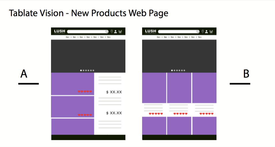
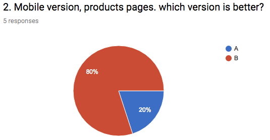
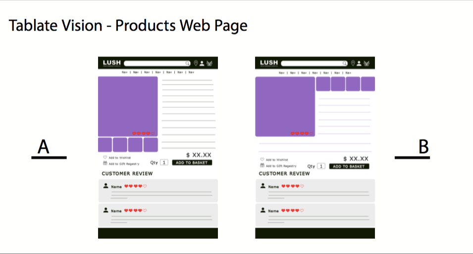
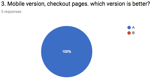
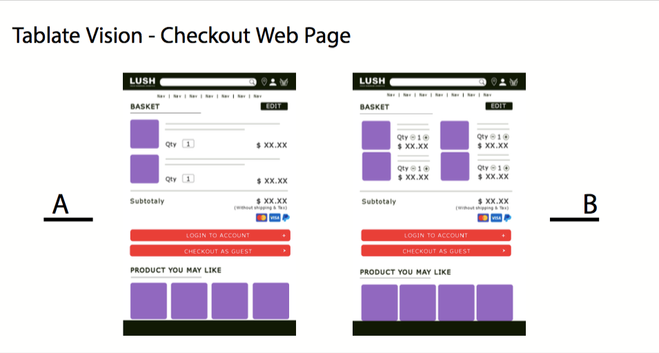
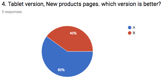
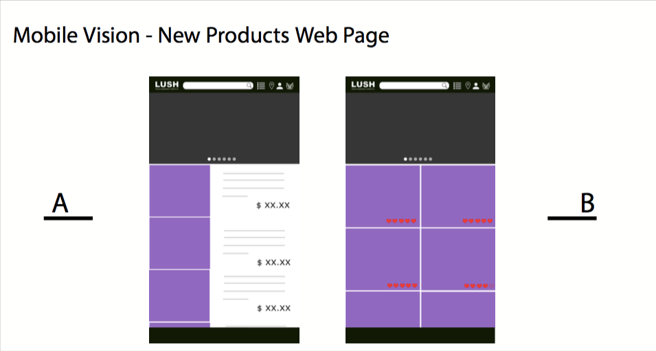
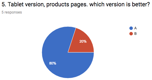
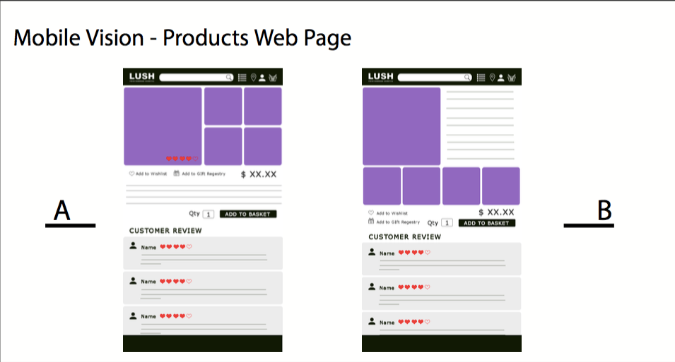
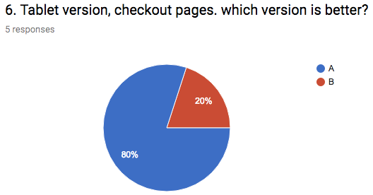
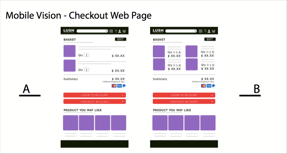
5. A/B Testing
I pick two of my favorite visions of each pages. I list them and make a survey and hope to get feedback for my final design.
After the feedback, some good ideas come into my mind. I started to add something into my new wireframes.
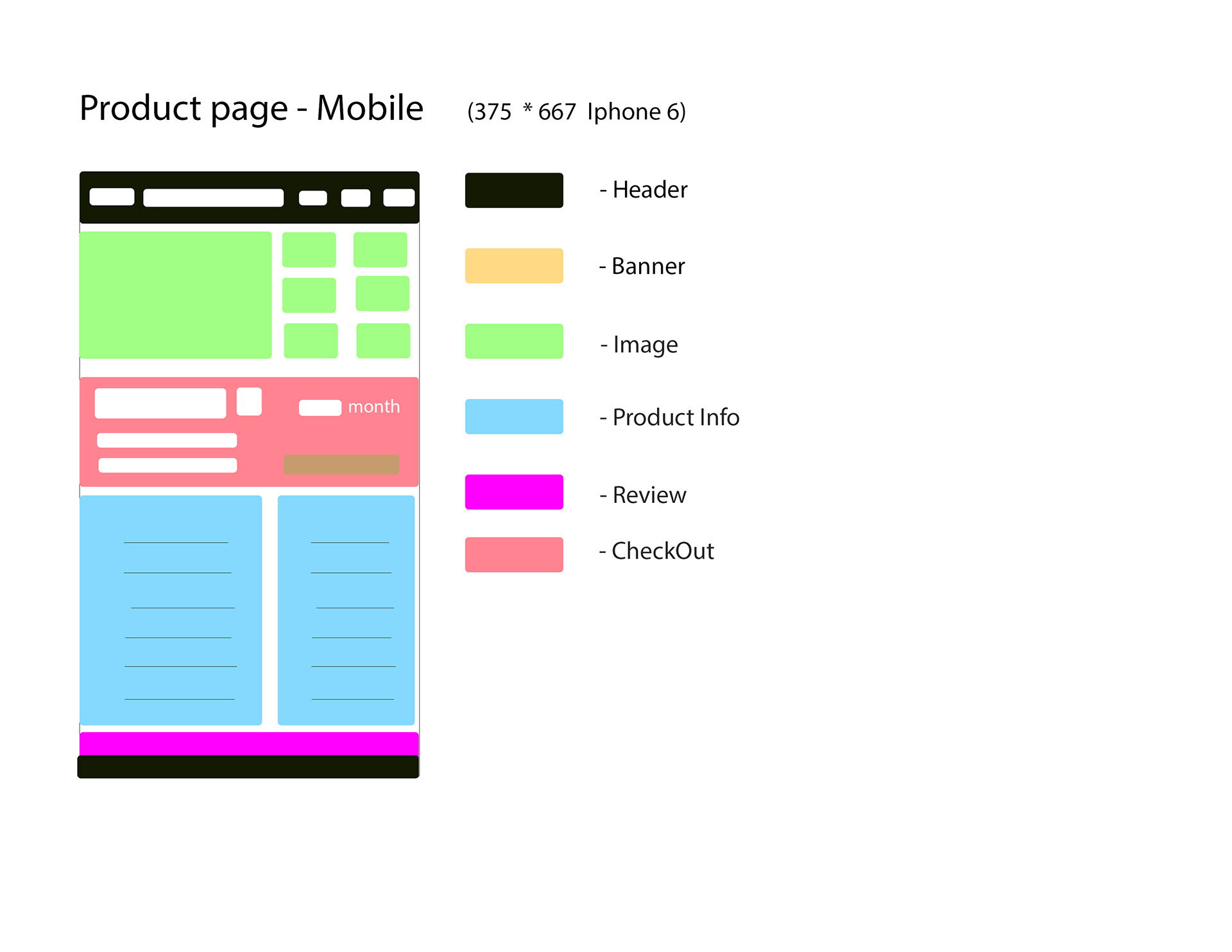
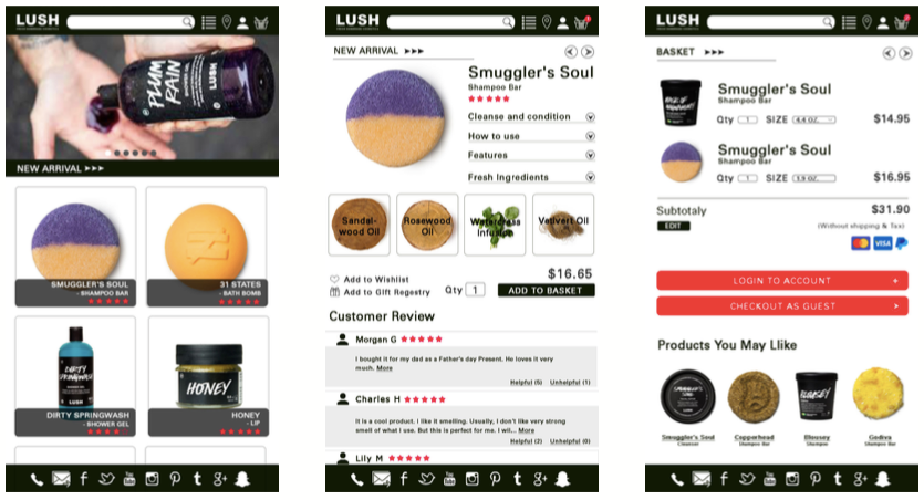
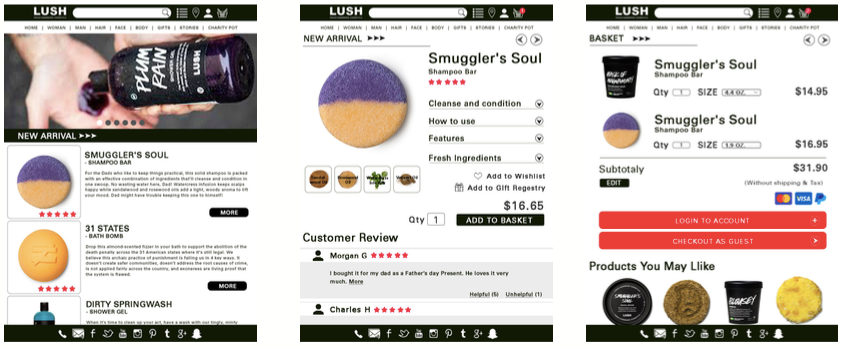
6. New Wireframes
I add some icons, some functions in my new vision. It can help users to easy use the page like I add phone icon, email icon, and social media icons on footer bar. At the same time, I add the tag for reminding users where they are and how to go back to the previous page. I also add a confirm window with users when they put the product into the shopping basket. The wireframes are more detail.
I. New Mobile Vision Wireframes
II. New Tablet Vision Wireframes
7. Final Design with Prototype
I. Mobile Vision
Prototype Link: here
II. Tablet Vision
Prototype Link: here
Conclusion:
From this Project, I noticed that how to think the way as a user. The most of the time, I was thinking how to use a website to communicate with users, what makes users to have options and what is they really cared when they are shopping online. This is a very important part for a UX Designer. When I doing the wireframes and A/B testing, I did changed a lot of times of my design. I want to give users best experience by my design.