The page content is very dry.
Contrast Problem.
No hightlights and key points.
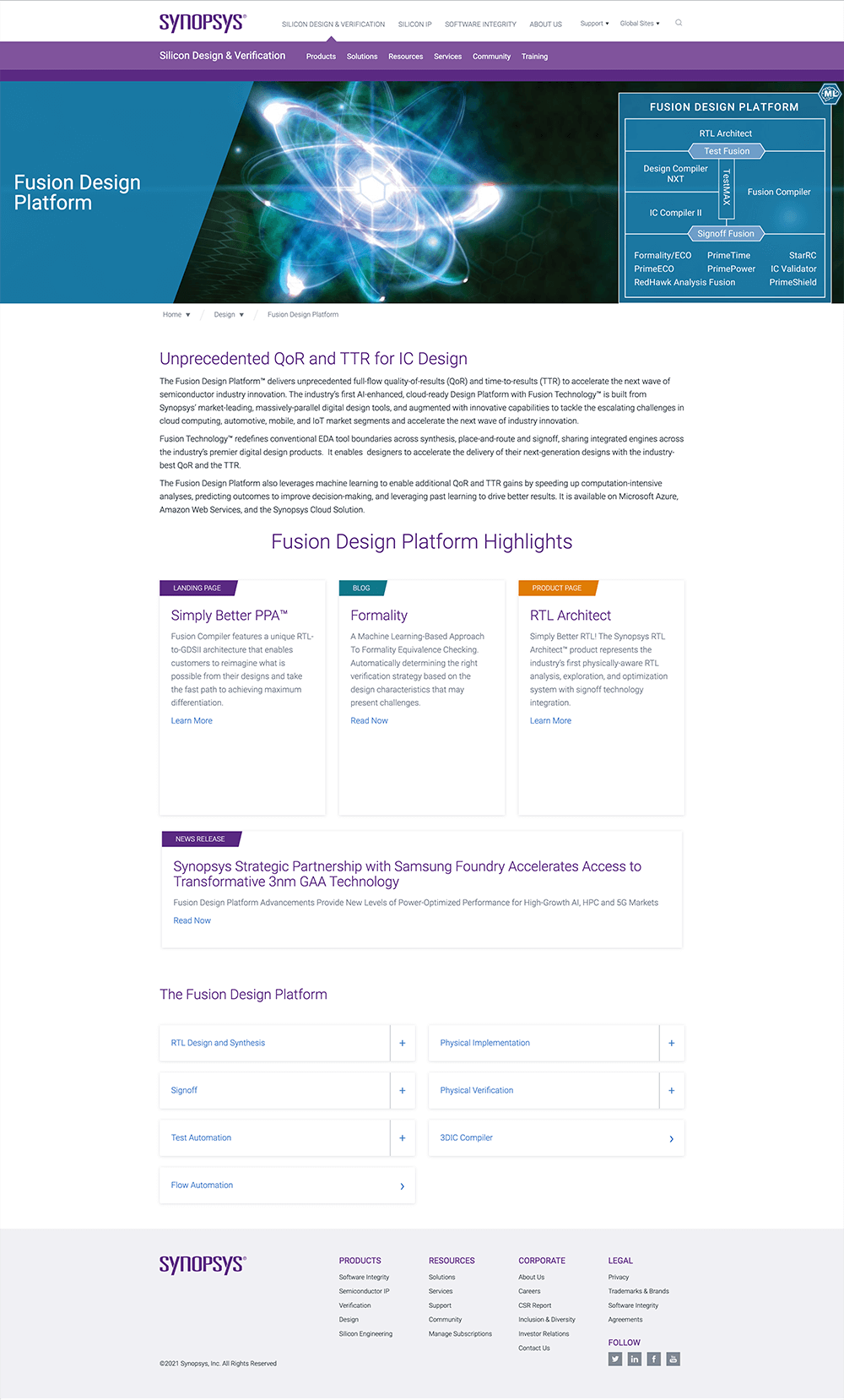
The page top banner has a problem with the title, and the platform diagram pulls users' eyes to two sides.
There is no breaklines for different sections - no focus and strategy.
List of platform doesn't visual attractive.
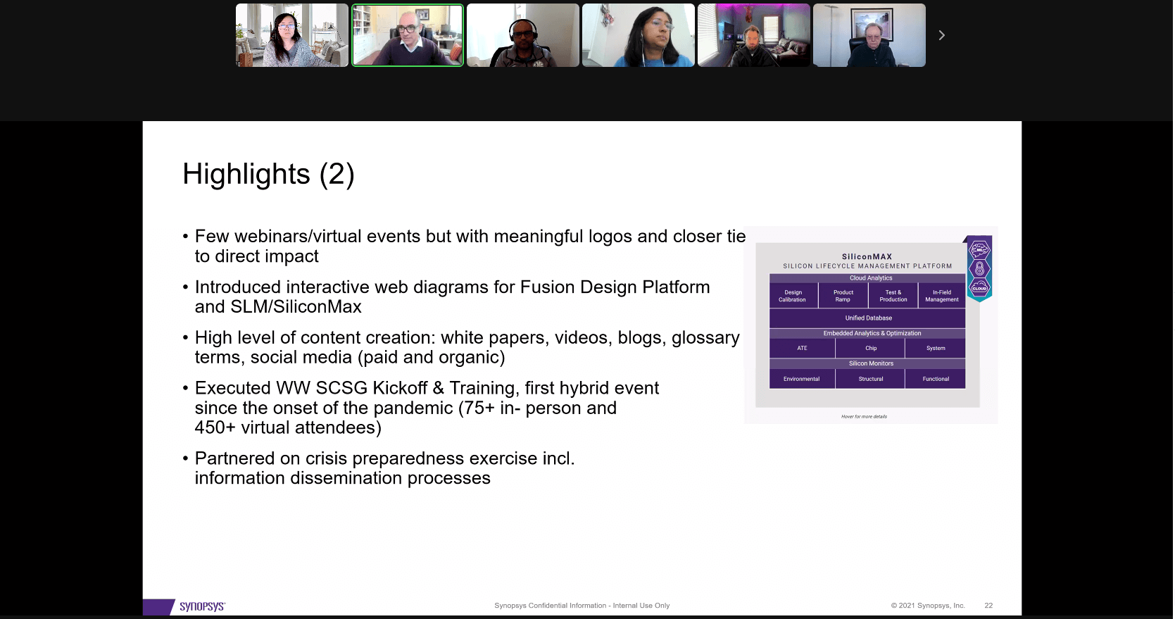
The page updated to a clear structure, break the different sections with the purpose, create hightlight and keywords for Benefits, and move the static image diagram to an interactive diagram.
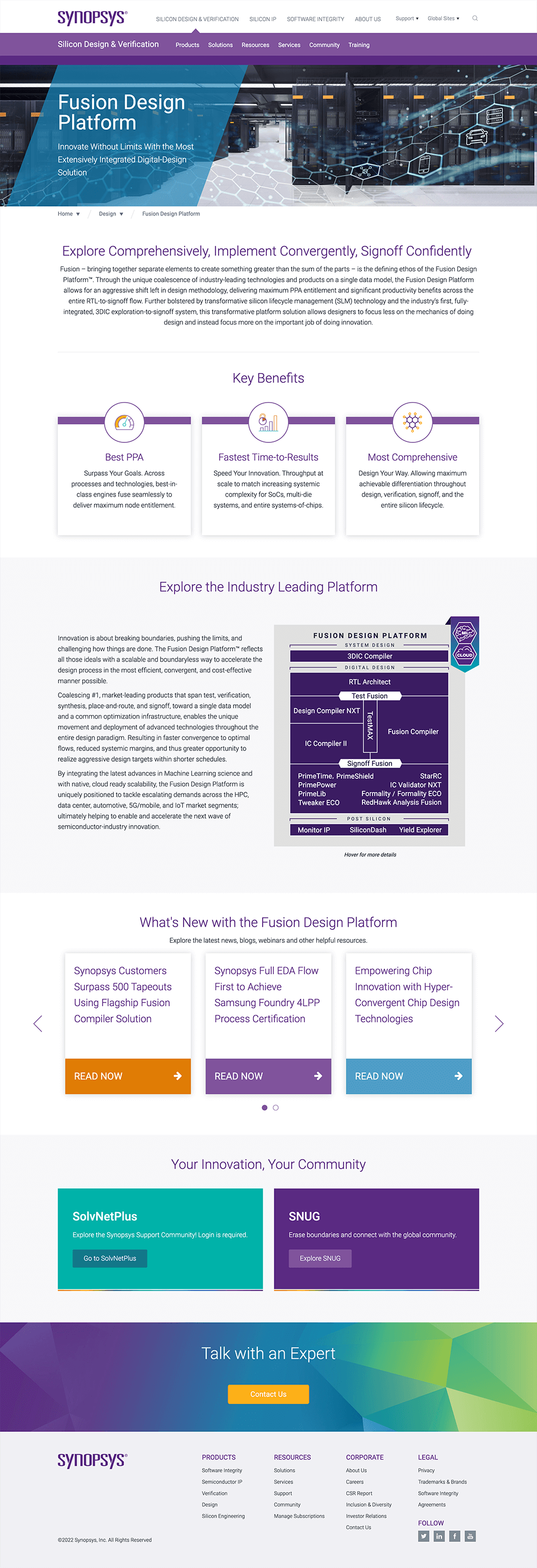
Banner changes to be a simplify banner with title and subtitle only.
Add a summary for new customers and how it helps in the industry.
Interactive diagram show users more about how everything works together.
The latest related News is helping the users to explore more.
Pull very important and popular resources to the usrs.
Suggest the users to talk to the sales/engineers to learn more when they have any questions.
It Helps the team gain incredible traffic.
Programming skill was approved.
Design skill was approved.