The request is from the R&D Engineer team at Armenia
To make it user friendly
To build resonable design functions
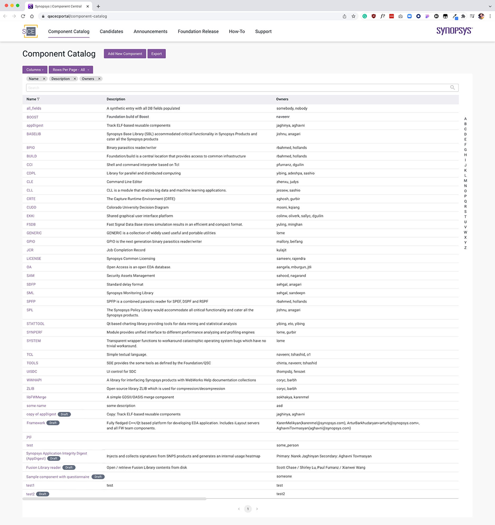
01.
Not match the Synopsys branding
02.
The design alignment problem
03.
The CTA buttons are dispersed
04.
Too many search inputs
05.
Filters are not visible
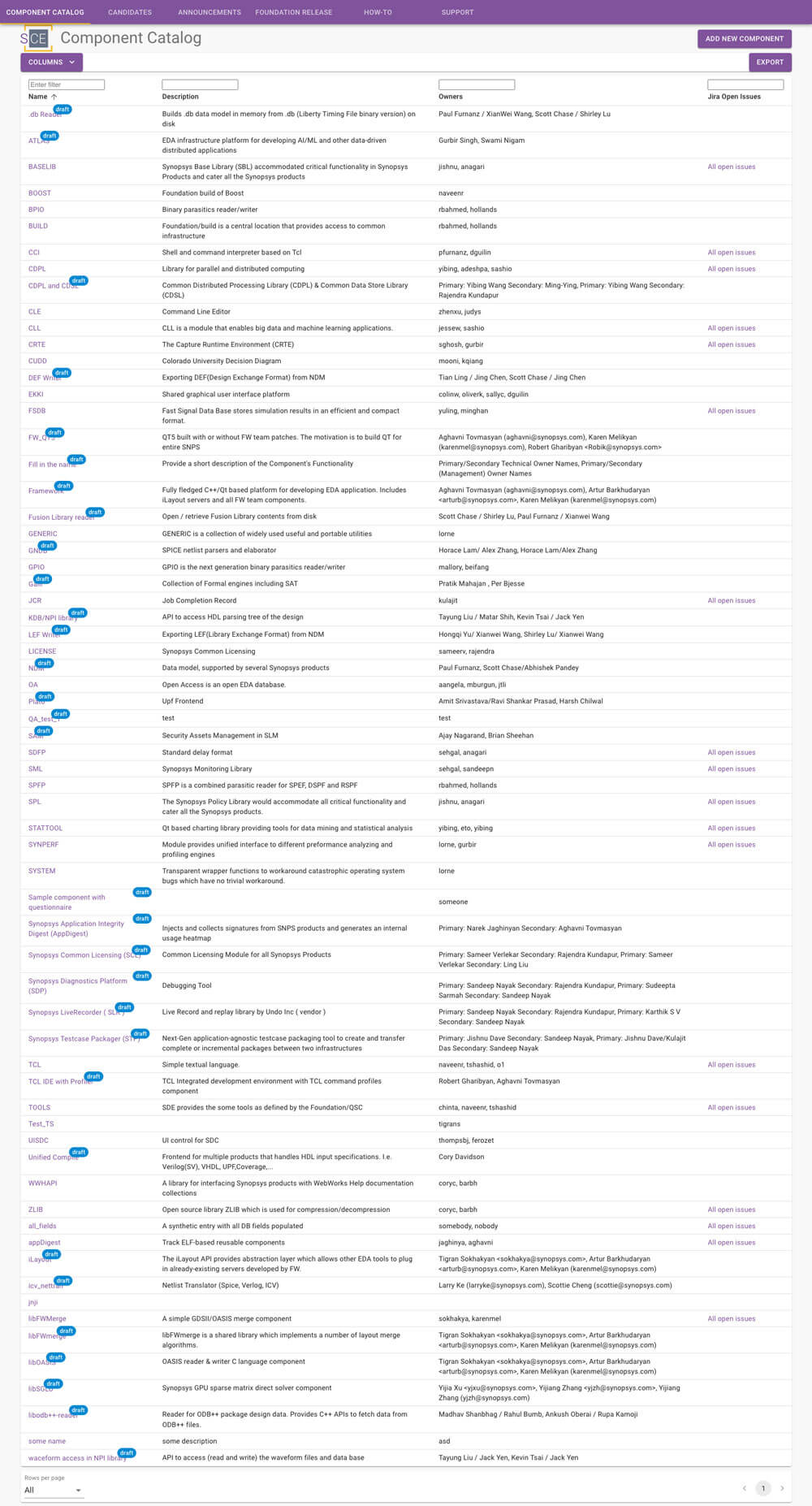
There are several design updates on the product
The function of filter information and remove filter information.
Not just the filter button and search work, but the alphabet filter works good.
It is a test mockup and can be viewed with clicks
My manager shared this feedback to me