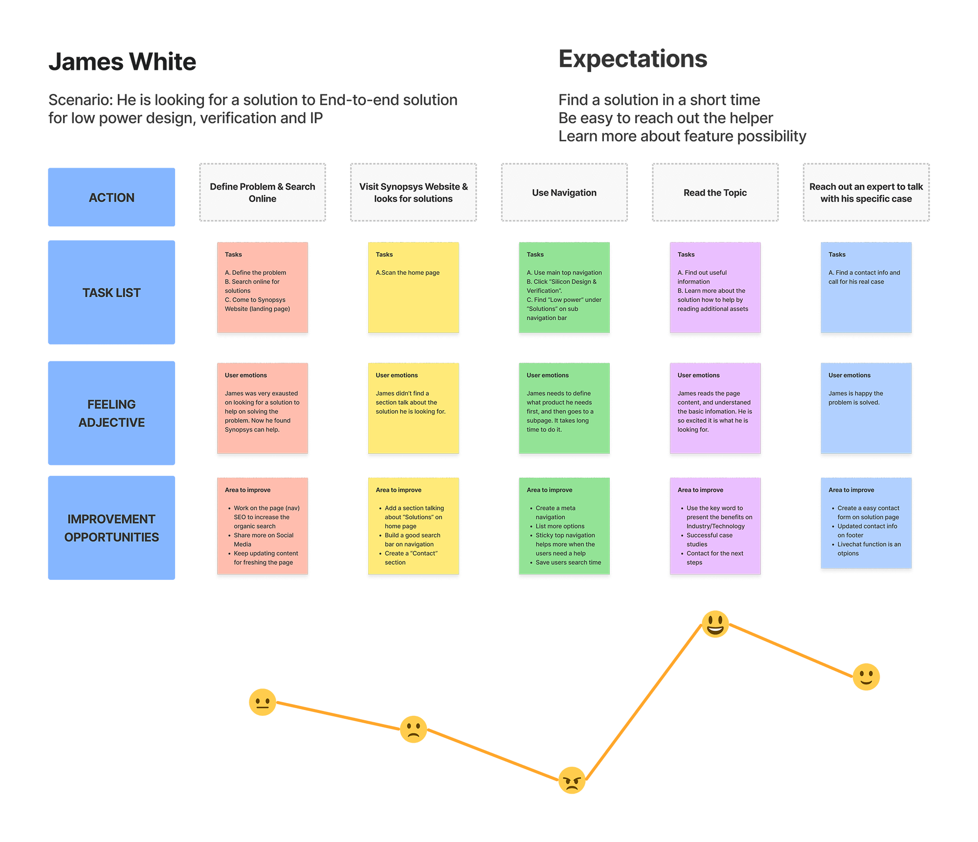
The request from the executive team about the new navigation redesign.
Tool Used


Period
2 month
Devices
Responsive Web
Table | Mobile
Participation
UX | UI
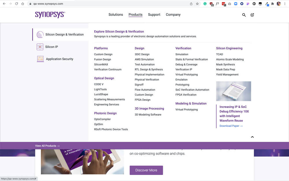
Synopsys has some competitors. They have similar products and company structures to Synopsys. Trying to understand what the competitors doing in their navigation will give some successful examples to consider.

| Company Name | Navigation Position | No. of Levels | First Level Categories | No. of Levels on Tablet/Mobile | Extra Assests | Conclusion Notes |
|---|---|---|---|---|---|---|
| Cadence | Vertical | 3 levels | Products, Solutions, Support, Company | 3 levels in 3 pages | Promotion Assets and Research |
* Promotion Assets are good options for navigation. |
| arm | Horizontal | 2 levels | Products, Solutions, Partners, Support & Training, Resources, and Company | 2 levels in 2 pages | Contact, Search and Login | |
| Ansys | Verticala | 3 levels | Why Ansys, Products & Services, Learn | 3 levels in 1 page | Search, and top link bar (Countries & Regions, Countact Us, Careers, Students and Academic, Customer Center, and Free Trials), promotion assets, and Free Student Software | |
| NVIDIA | vertical | 3 levels | Products, SOlutions, Industries, and For You | 3 levels in 1 page | Shop, Drivers, Support, icon search, icon shopping card, icon account | |
| GlobalFoundries | vertical | 2 levels | Technology Platforms, Markets, Manufacturing Services, GF Communities, About Us, Careers GF Newsroom | 2 levels in 2 pages | Languages, Investor Relations, icon Search | |
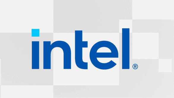
| Intel | vertical | 2 levels | Products, Support, Solutions, Developers, and Partners | Similar style and functions with Responsive Web(Tablet), 2 levels in a page (Mobile) | Icon Account, Icon Languages, Icon Search | |
| Samsung | vertical | 3 level | Mobile, TV & Audio, Appliances, Computing, Desplays, Offers, and #YouMake | 3 levels in 2 pages | Promotion Assets, Explore, Support, For Business, Outlet, Icon Search, Icon Shopping cart, and Icon account | |
| tsmc | vertical | 2 levels | Delicated IC Foundry, Investors, Press Center, Careers, ESG, Research, and About TSMC | 3 levels in 1 pages | Icon Search, and Language |
01.
Sticky navbars
02.
Mega menus
03.
Universal navigation
04.
Vertical sliding navigation
05.
Globally hidden menus
06.
Responsive subnav menus
07.
Top story carousels
08.
Table of contents
09.
All-caps corner links
10.
Single page dot navigation
Resouces
01.
Executive C-Level professional
02.
Corporate Management Professional
04.
Engineering Technical Profesional
05.
Systems Architect Technical Professional
Click to see the detail
01.
No second level of navigation (wasted navigation area).
02.
The first main navigation elements are duplicated to the 3 products.
03.
Uppercase is not user-friendly for reading.
04.
Search is too short to view the full type.
01.
To improve the use of the main navigation.
02.
To add more functions to promote assets.
03.
To better match branding and make the design more consistent.
04.
To have user-centric design.
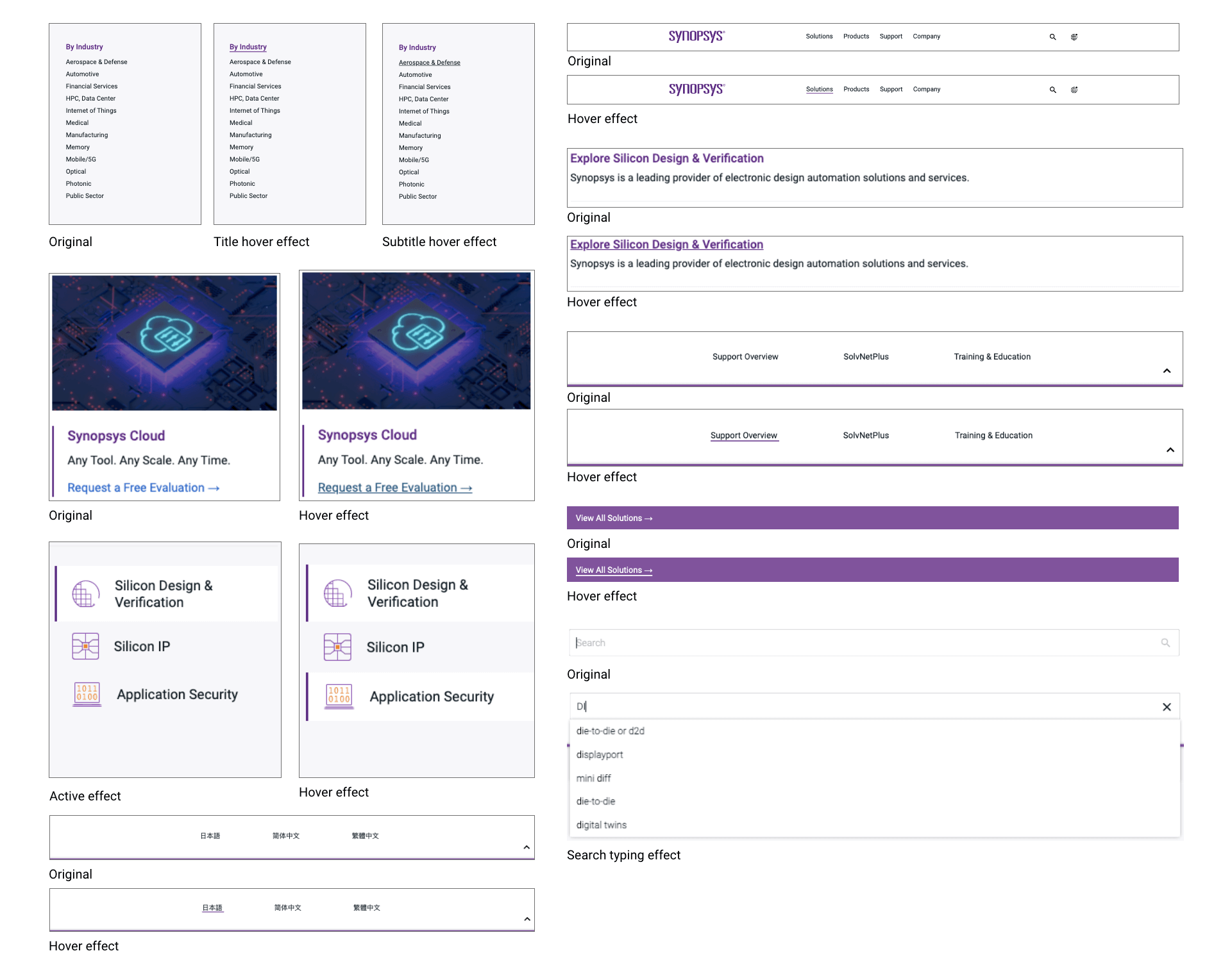
There are several updates on the top navigation
01.
Replace the 3 Products and About Us to Solutions, Products, Support and Company
Reason: Previous navigation was too minimal and didn't provide enough options to users.
02.
Make every dropdown navigation consistent
Reason: The first time a user visits the website, they are going to make sense of it in just a matter of seconds.
03.
Add a floating Tab under the products dropdown navigation
Reason: Navigation menus should have a clear hierarchical structure with every category and clickable sub categories included in the menu.
04.
Add a category page for all solutions and all products
Reason: The navigation list shouldn't include all information but only very important ones. Keeping all lists on a separate page will give users opportunities to find more.
05.
Add promotion asset sections on dropdown navigation
Reason: Some important assets won't be missed when the users navigate.
06.
Use icons for search and global site instead of content
Reason: Using search and global site icons will save space for the main navigation. Those icons easily identifiable by users.
07.
Top navigation is sticky to the top.
Reason: The users can visit main navigation anytime when they are viewing every page.
Click to see the detail
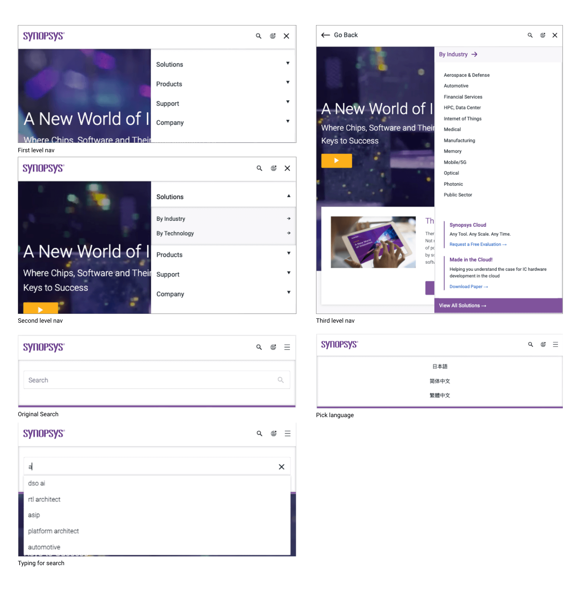
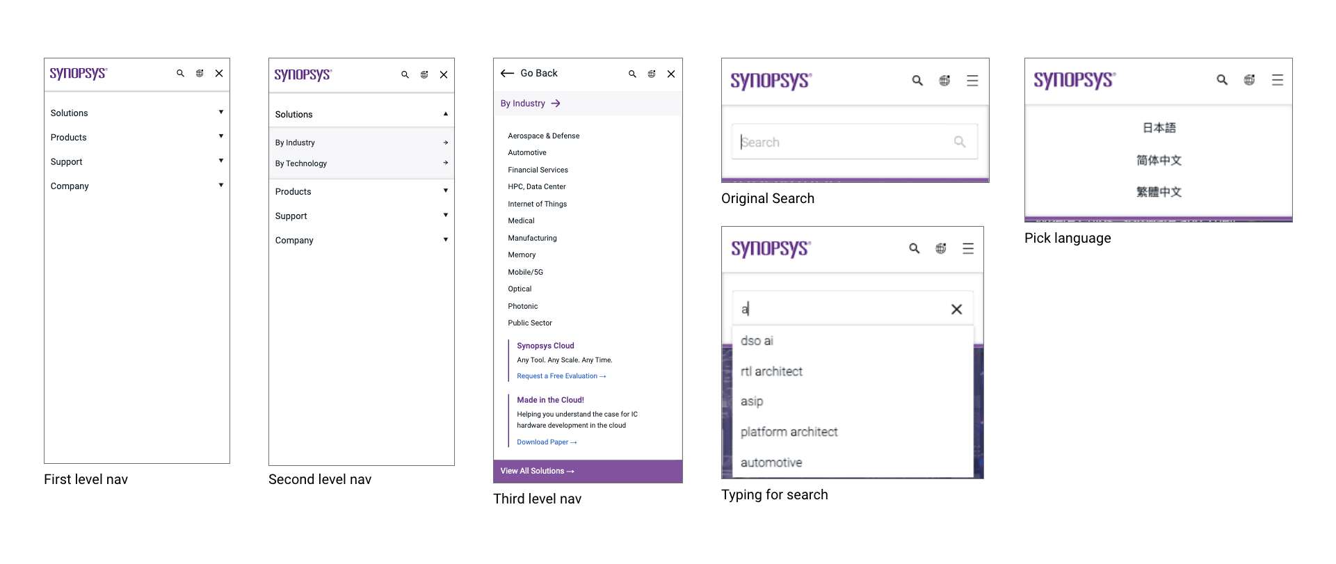
One page of the wireframe example
This is a responsive test mockup
The dropdown navigation gives more options to the users now.
Third level navigation on web appears on secondary navigation on mobile.
Detail about how it works on Mobile.


#111c24
#5a2a82
#80539c
#316aca
#23527c
#f7f7fa
#c1c1c1
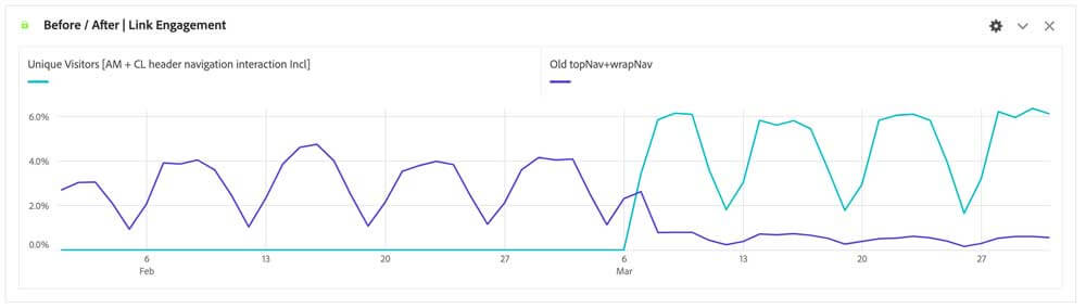
I learned a lot from this opportunity working with others across different teams on this project. During 2 months, I worked with products team, marketing team, development team, and data team, and presented my concept, designs to executive team and share my thoughts to other designers to get feedback. From this project, I definitely got benefit from practicing my communication skill and learned how to make the project goes smoothly among different teams.
Communication is the key when talk with stakeholders.
Scenario with storyboard is a good method to show case.
Create an elements with component idea in the mind for feature use.
Focus on consistency but make it attractive by creating at least 3 options.
keep aligning the ideas in the team to get brainstorm.
Sticky on the strong opinion but compomise with some feedbacks.