Building a homepage with a professional feel is a bit like standing in front of a buffet counter with an empty plate, waiting to fill it with all sorts of delicious goodness. But because it is a buffet, So have to pick the limited but good food to fill the plate. When I start to think about this project - especially it is the face of the company, I spent numerous time figuring out the best solution.
01.
It helps users identify what the website is about
An effective homepage tells the user who the company is and what the company do as soon as they set eyes on it. If it’s not immediately apparent, The most visitors won’t stick around for long.
02.
It establishes the company brand right off the bat
For most users, your homepage will be their first exposure to the business – first impressions really do count. This is a chance to convey what the brand is about, and convince visitors to trust the company and stick around.
03.
It allows users to navigate the site easily
The homepage is like a virtual crossroads with each element acting as a road sign, guiding users in the right direction. It should make the visitors don’t even need to think about consciously taking the next step.
04.
It Helps the company Cash in on those conversions
No matter how good the product is, customers won’t buy into it if the homepage doesn’t look professional. All of the points above combine together to do one key thing: encourage visitors to convert.
We live in a world of fast answers and instant gratification, which has resulted in an impatient audience that’s increasingly demanding. Most of us are conditioned to expect to find what we’re looking for in a matter of seconds, so the job of an effective homepage is even more important – but also more challenging too.
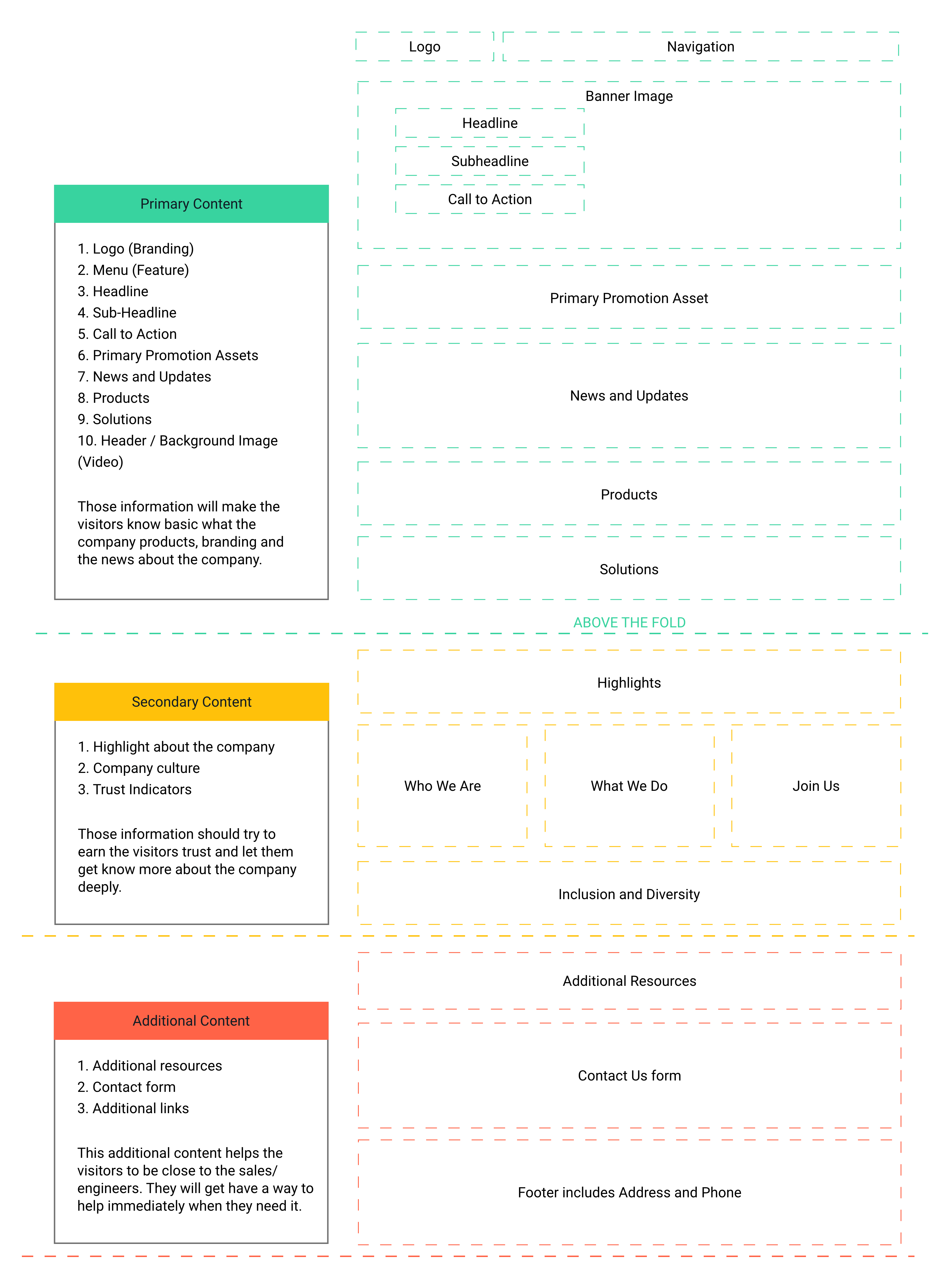
01.
Headline
02.
Subheadline
03.
Call-To-Action
04.
A Logo and Clear Branding
05.
Images
06.
Navigation Bar
07.
Value/Trust Indicators
08.
Benefits List
01.
Overwhelming clutter
02.
A long list of features
03.
Avoid jargon
04.
Steer clear of funky fonts
05.
Not optimized for mobile
Resouces

Primary Users
Potential Customers
Looking for help
Haven't made a decision yet
In a comparison process
Secondary Users
Existing Customers
Know what he is looking for
Want to learn more for feature
May look for help
Intermediate Users
Job Seeker
professional worker
Want to learn more about Company
Potential Employee
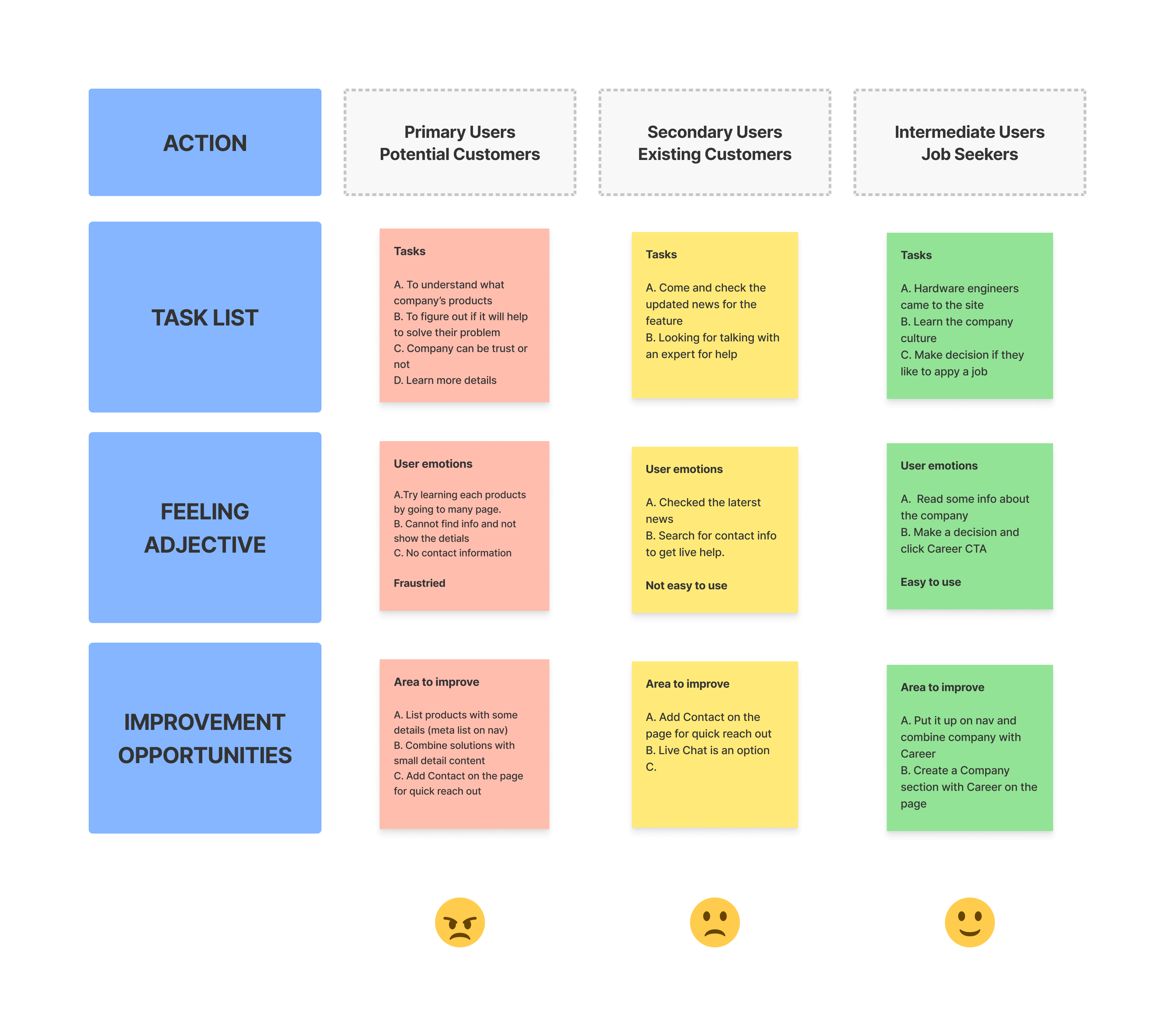
The primary users should be the first target. But it seems the first targed users cannot get help easily.
It is definately the biggest problem I need to solve.
Click to see the detail
01.
Over Use Images
Numerous assets hard to read - the content overlay an images
02.
Overwhelming clutter
Each sections don't have a clear breakline to separate them
03.
Jargo
No enough additional summary to the specific jargon
04.
Logical Confusion
The page structure wasn't matched users' cognitive psychology
05.
Bad Contrast
The whole page was flat without focus
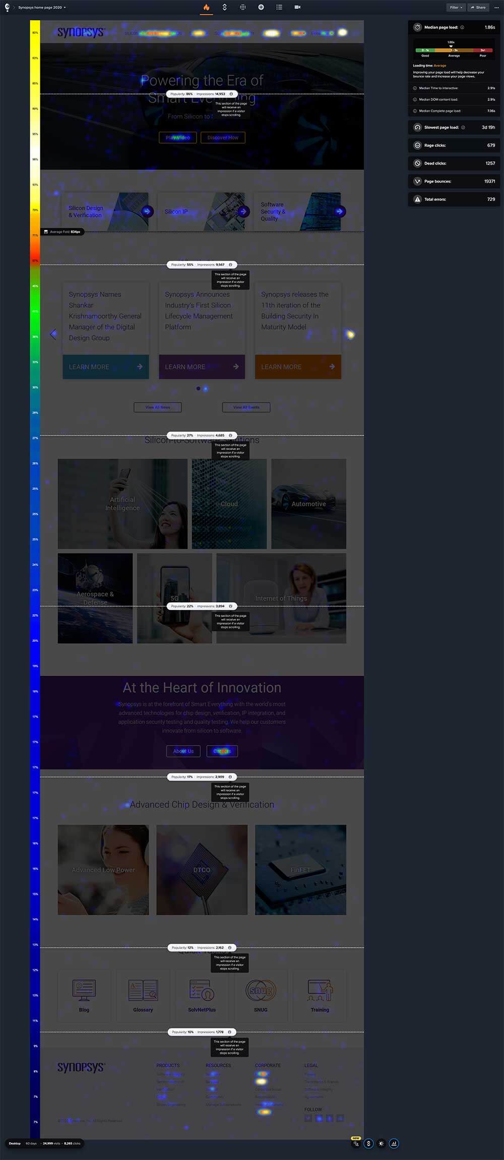
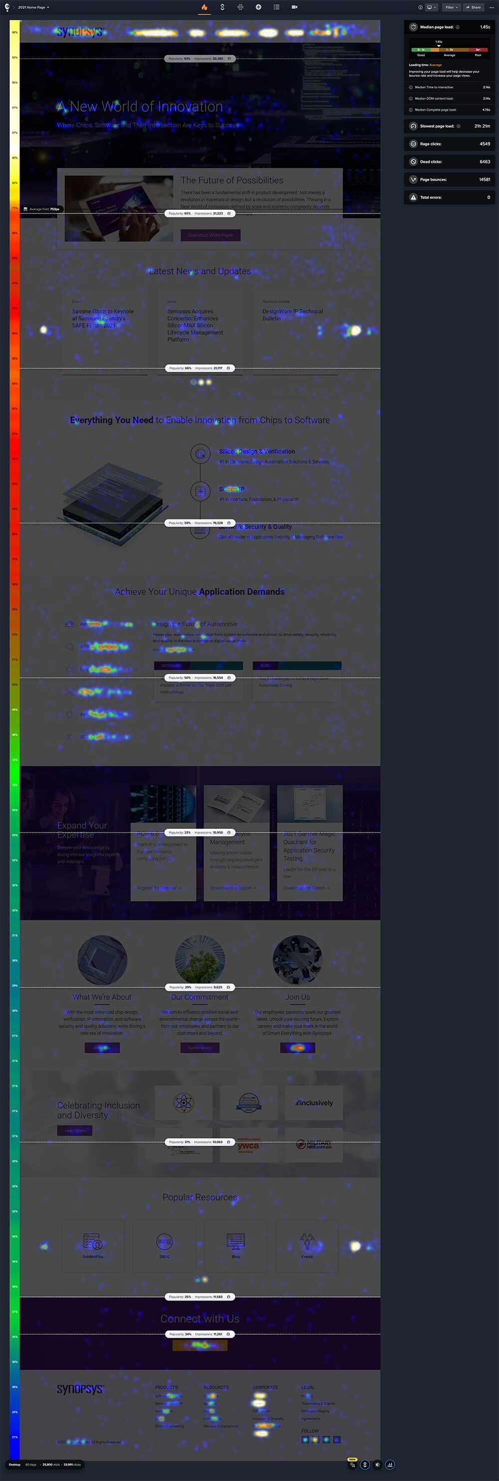
I set up a 90 days testing period with Crazy Egg to see how is the traffic like. It showed with an obvious bad result (Image below). At the same time, I invterviewed hardware engineer friends working at semiconductry industry and asked their feedback after they took a test on the previous homepage. The result approved my theory.
01.
To show better page structure and the company branding
02.
To help the users out and reach the valuable information quickly
03.
To increase the traffic to the page
01.
To clean up and repurpose each section
02.
To create a clear page structure separated by the target audience
03.
To make better page focus
04.
To build logic for page visit
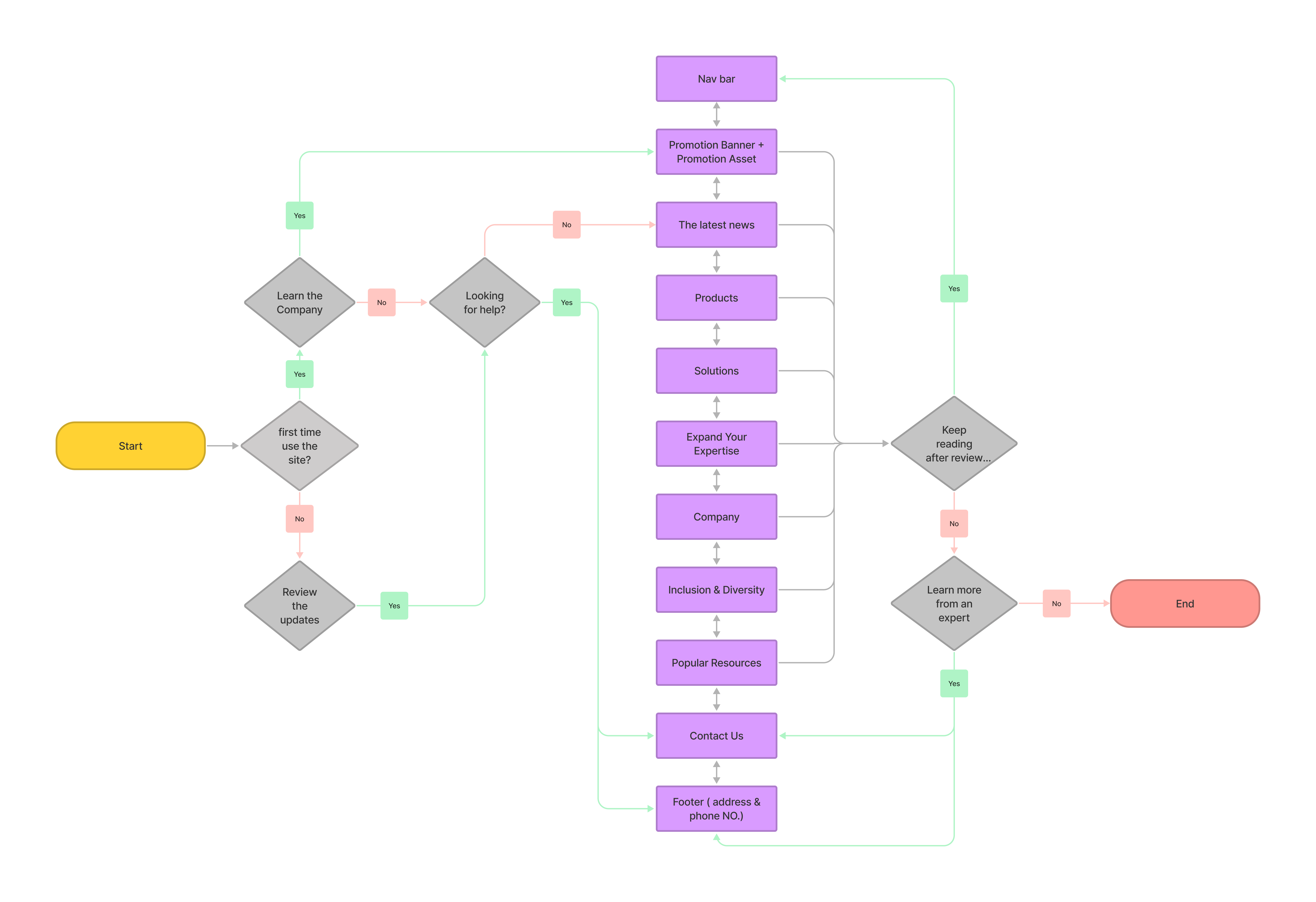
Click to see the detail
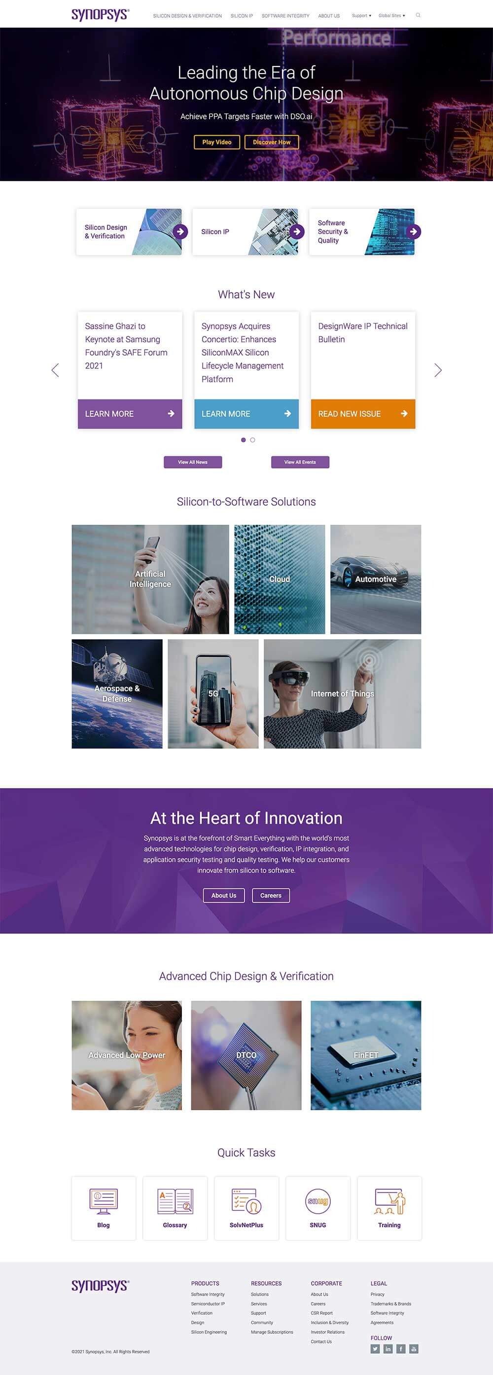
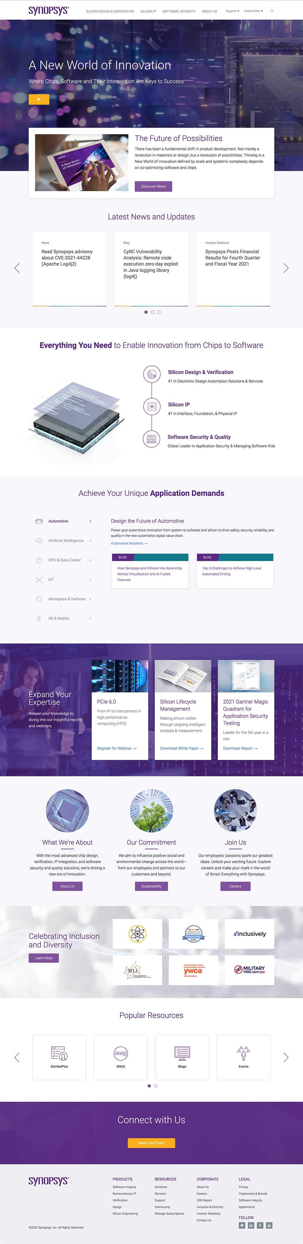
One page of the wireframe example
Recreate a new home page after collecting all information from the different teams
01.
Change banner ghost CTA to a solid play button
Reason: The ghost buttons are not visible with the video banner.
02.
Make primary linked CTA to a promotion section
Reason: Promoition section will give more information to the visitor compared to primary CTA only.
03.
Created a new UI for the Latest News and Updates
Reason: Show the products with strong marketing content for users.
05.
Solutions section has the floating tabs
Reason: The floating tabs will promote more info for customers to understand how it helps them.
06.
Add highly recommendated assets
Reason: Share to users the most critical assets to engage with them.
04.
Change the style of products list
Reason: Show the products with strong marketing content for users.
07.
Company Culture section
Reason: Highlight the company's culture, especially for potential customers or employees.
08.
Keep the Quick Tasks and list more resources
Reason: The carousel list's new order provides more options for users based on popularity. The new title content is stronger
07.
Add Contact Us section
Reason: Help users with what they are looking for, but cannot find out with site resources.
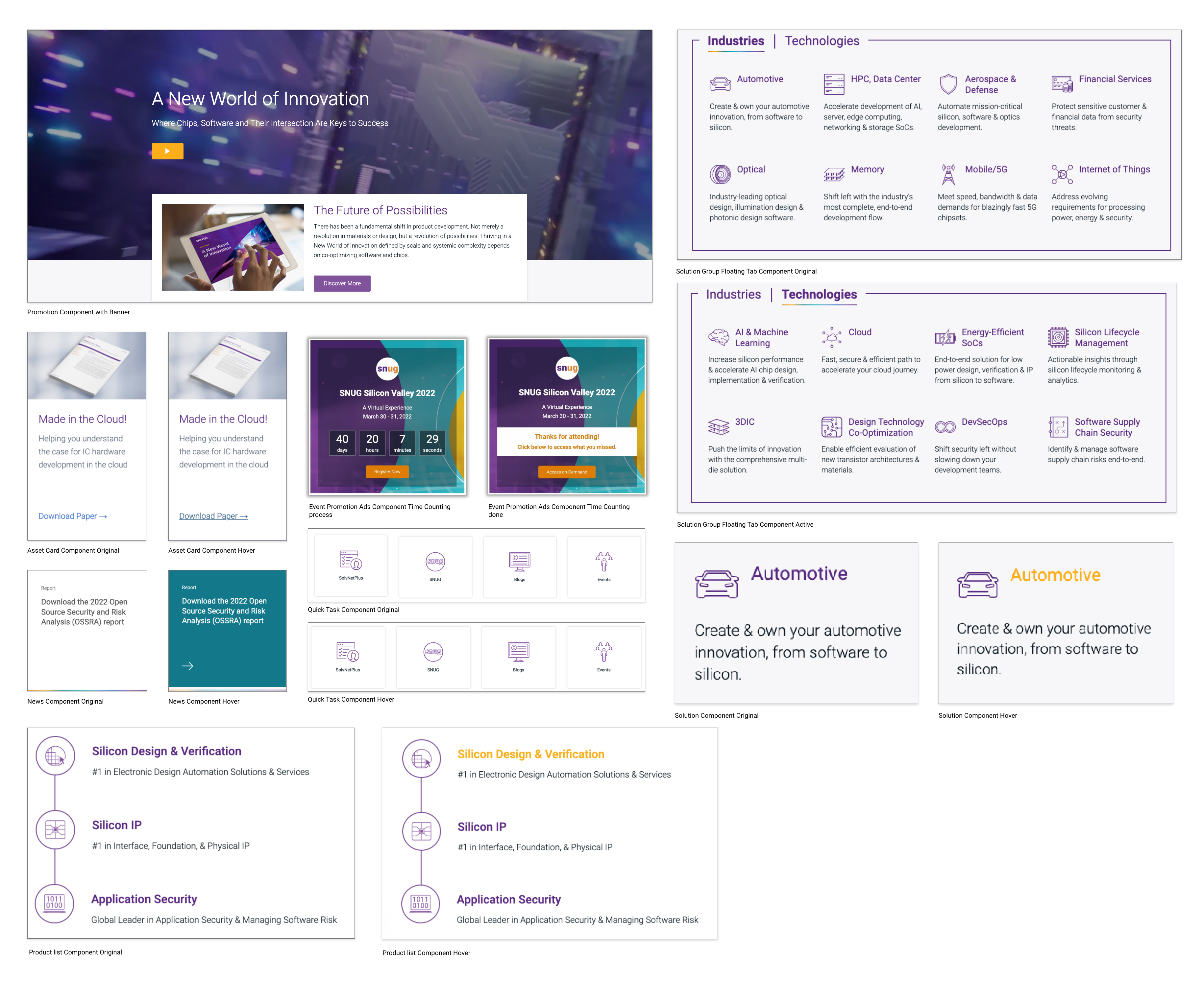
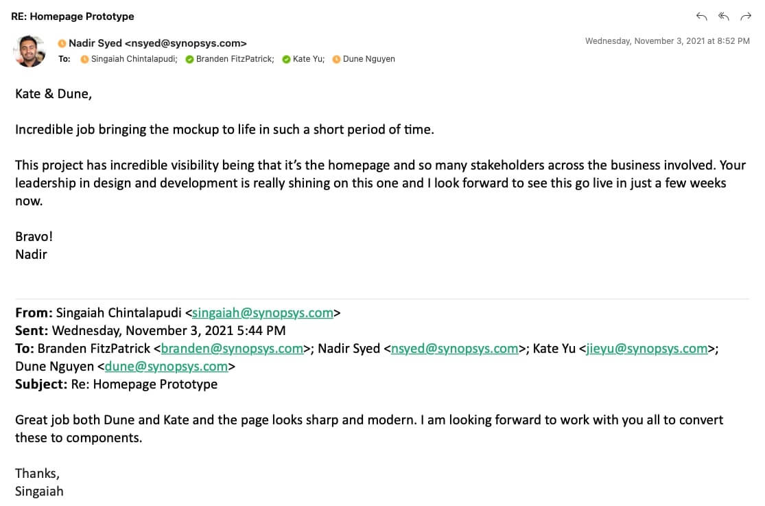
The business units wanted to add more solutions to the list. Then I considered using another floating tab style to present both industry and technology. Each solution tab is limited to 8 keys. A short sentence will summarize the solutions. The event team wanted to have a event spot on home page. SNUG is the most important event every year. I decided to promote the event content on the left side with SNUG World landing page and all events page CTAs and leave the right side for promoting the SNUG register ads with a countdown timer (link to SNUG microsite). And the team wants the SNUG event to be promoted higher on the page. Because the event section is a generic section on the home page, I decided to help them build a promotion ad sticky on the bottom of the browser. All users can see the promotion bar when they open the page, but for the convenience of the users, this promotion bar is closable.

01.
Updated the solution UI to a new style
Reason: Floating tab shows 8 solutions in each categories.
02.
Add an event section on HP
Reason: Promotion countdown timmer was added into the new design for feature component use.
03.
A closable bar sticky on bottom browser
Reason: All users can see the promotion bar when they open the page. CLose it when they want.
Each solution tabs have 8 solutions.
See how solution and event sections respond on Mobile.
I created a CSS and JS function for the time expired to replace with the leading statement and an on-demand CTA.
#111c24
#5a2a82
#80539c
#316aca
#3860be
#23527c
#12788a
#fcaf1a
#fc941d
#e07c05
#67768b
#4c9ec9
#99cc33
#f0f0f4
I worked on all programing work. Test it on my own folder under the AEM system. Each section was programmed separately and then combine on the home page. Test all the functions before push it live.
During 60 days of the holiday season, total site visits were 25,800 and clicks were 33,991 compared to before 24,999 visits and 8265 clicks at the same time on 2020.
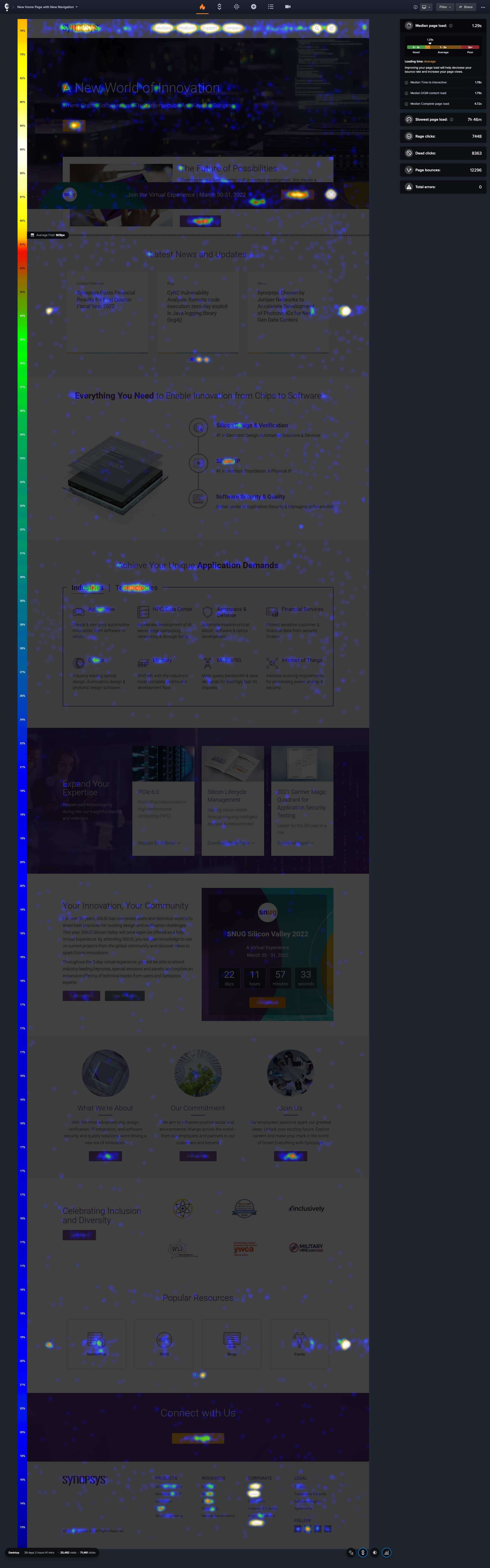
During the initial 39 days, there were 25,482 visits and 71,481 clicks. An incredible win.
During the two months, I focused on trying new UIs and layouts and pretended I am a user to feel their pain points. Quickly, I noticed where the problem is. And I was trying to balance and align the company's perspective and the users' needs. There are some agreements and disagreements in each meeting with stakeholders. I tried to stand on everyone's point to explain my concept and let them understand the reason I did this. Usually, Testing results and data-driven are good ways to explain everything but before that, I still need to stand on my point strongly sometimes.
Make a good plan before starting working on a project.
Listen carefully to each group's points and collect them.
Give at least 3 options to them and recommend 1 of them with reasons.
Keep asking why to stakeholders and myself during the work.
Not everyone has a good imagination, prepare more before present.
Always update the information with the manager and discuss the solution with the team.
Do not fear making a mistake and keep trying.