To look for solutions for updating AEM system to be more user-friendly.
Tool Used


Period
2 month
05/03/2022 - 06/30/2022
Target Audience
Page Authors - Internal Users
Customers - Exteral Users
Participation
UX | Case Study
UI | Programming
Strategy | Presentation
Lead Workshop
I set two different surveys for different target audiences.

Primary Users
Internal Users
Product Marketers (Page Authors)
Create and Update Product Pages
AEM System Users
Secondary Users
External Users
Synopsys Customers (Page Visitors)
Real Clients - Chip Industry Expert
Product Users - Engineers
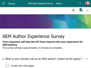
Basic Information About the Survey
22 Qestions
28 Participants
Date: 06/01/2022 - 06/10/2022
01.
Problem from Training
02.
Issue when using
Basic Information About the Survey
14 Questions
10 Participants on survey
13 Participants on Interview Meeting
4 Groups
5 Hours Interviews Totally
Date: 06/01/2022 – 06/10/2022
Intervew Study based on Survey
Primary users: Verification Enginners
Secondary users: Software Developers, Validation Engineers, Design Engineers, Engineer Managers and do on
01.
Each Page structure is different and inconsistent
02.
The same strategy sections use the different layouts on different pages (Not user-friendly for scanning the page)
03.
Branding is different on different pages (font sizes, title colors, spacing, and so on)
04.
Additional unused components are on the page (page Authors are not familiar with the AEM system)
05.
No clear break to separate the two sections (Bad contrast)
06.
Instead of using one existing component, page authors use multiple components to create the same layout

Strategy (Company)
Align One Synopsys strategy with the company

Consistency (External Users)
Make sure the product pages look consistent, and each page matches the marketing content and structure strategy

Efficiency (Internal Users)
Save the product team time by helping them to create a product page quickly with a placeholder demo page
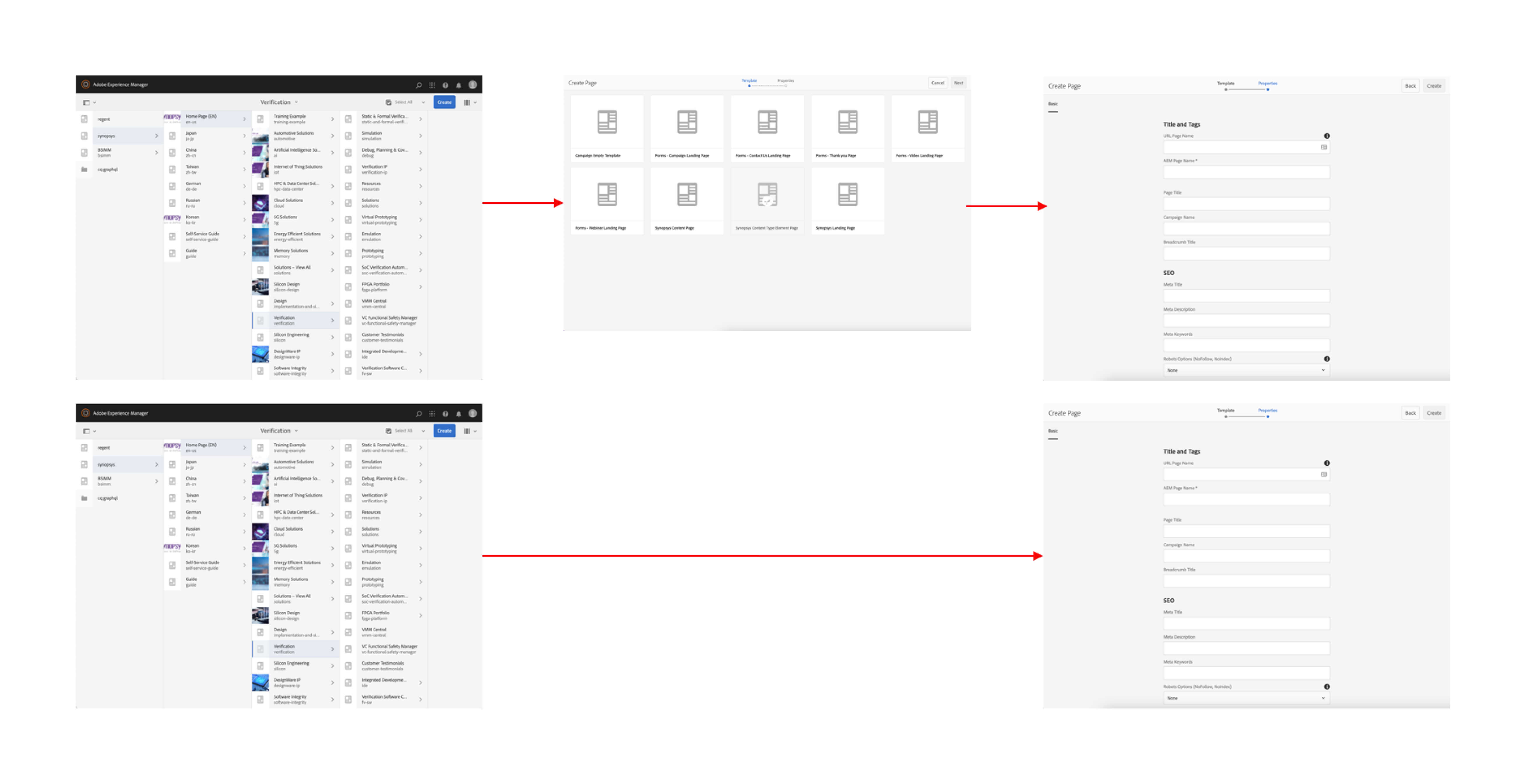
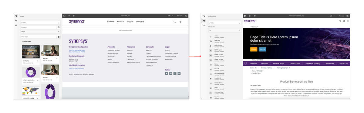
To Create a product template
01.
Align the page structures
Reason: Make the site the same branding and consistency. Be accessible for the users to scan the page with the focus.
02.
Pick components for each section to make pages consistent
Reason: UX team will work on the layout style and find the best practice for each section.
03.
Put the essential content types on each page for One Synopsys' marketing strategy
Reason: Use the same strategy on the product pages to align the marketing strategy.
04.
Create a demo page template for the page authors
Reason: Page authors can see the page visually and understand the thinking process of the strategy.
05.
Reduce the work process/time for the product team
Reason: Page authors only need to replace the placeholder content with actual content and delete the useless sections on the page.
06.
Use component fragments for some sections on the page
Reason: Update once and show on different pages to keep the easy updating. Never miss updates on every page.
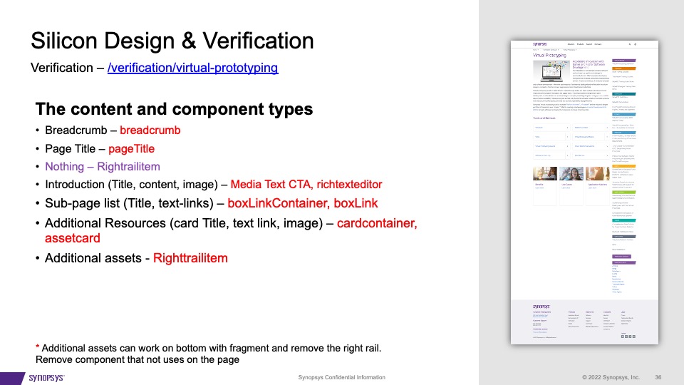
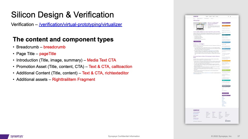
Studied over 30+ product pages under 3 BUs. The studied pages included top product page, and product page tier 2, 3, 4 as sub-product pages.
Some examples below.
Click to see the detail
There are several updates I will make on the design and workflow
Multiple-template will not solve the problem for the users. They will confuse the users, especially the beginner. Suppose we know this page will be under the product list. In that case, We can only provide one product page template to avoid chaos because the other templates like generic company information, solution, and event templates will not work with the products page.
The users will have a basic thinking guideline about the marketing strategy with the existing page structure and layouts. They only need to think about the content, replace the placeholder content with the actual content and then delete the unused components/sections. This idea will benefit the page authors' work efficiency and be perfect for keeping the pages consistent.
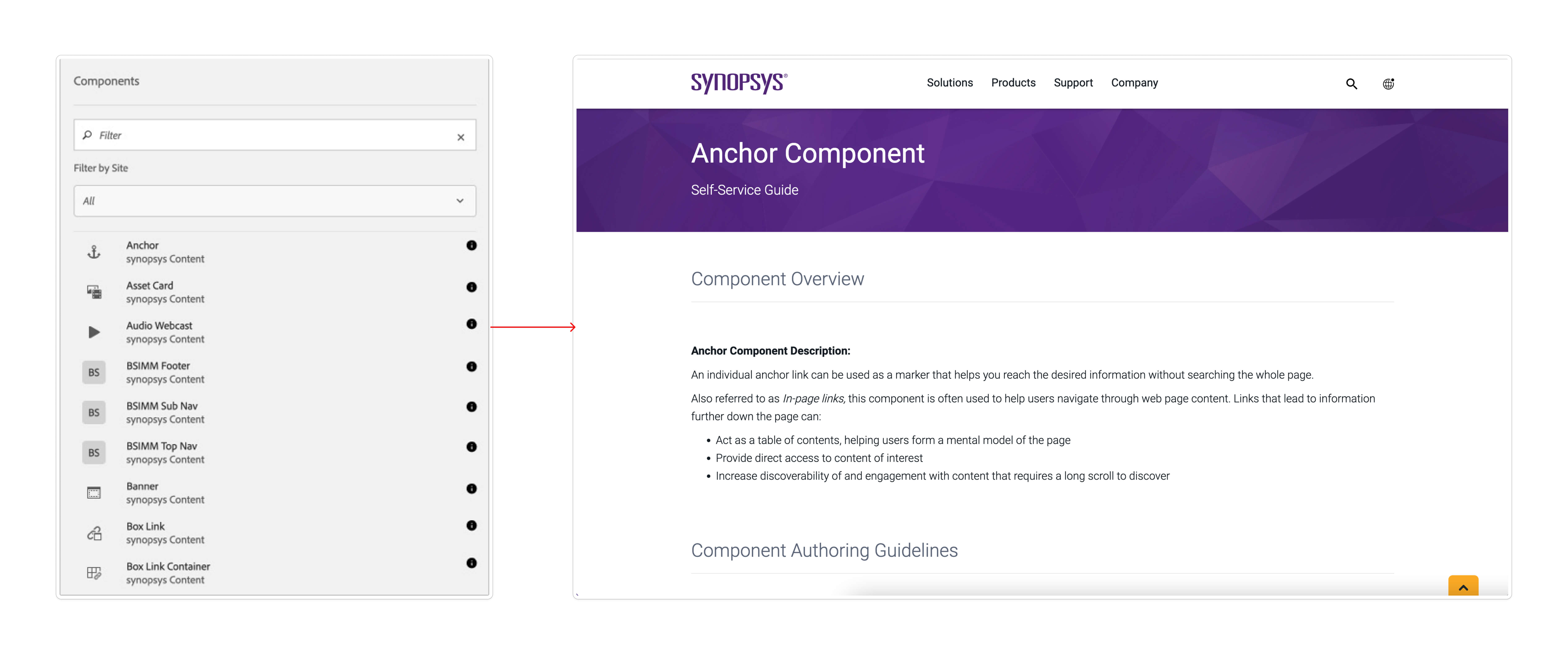
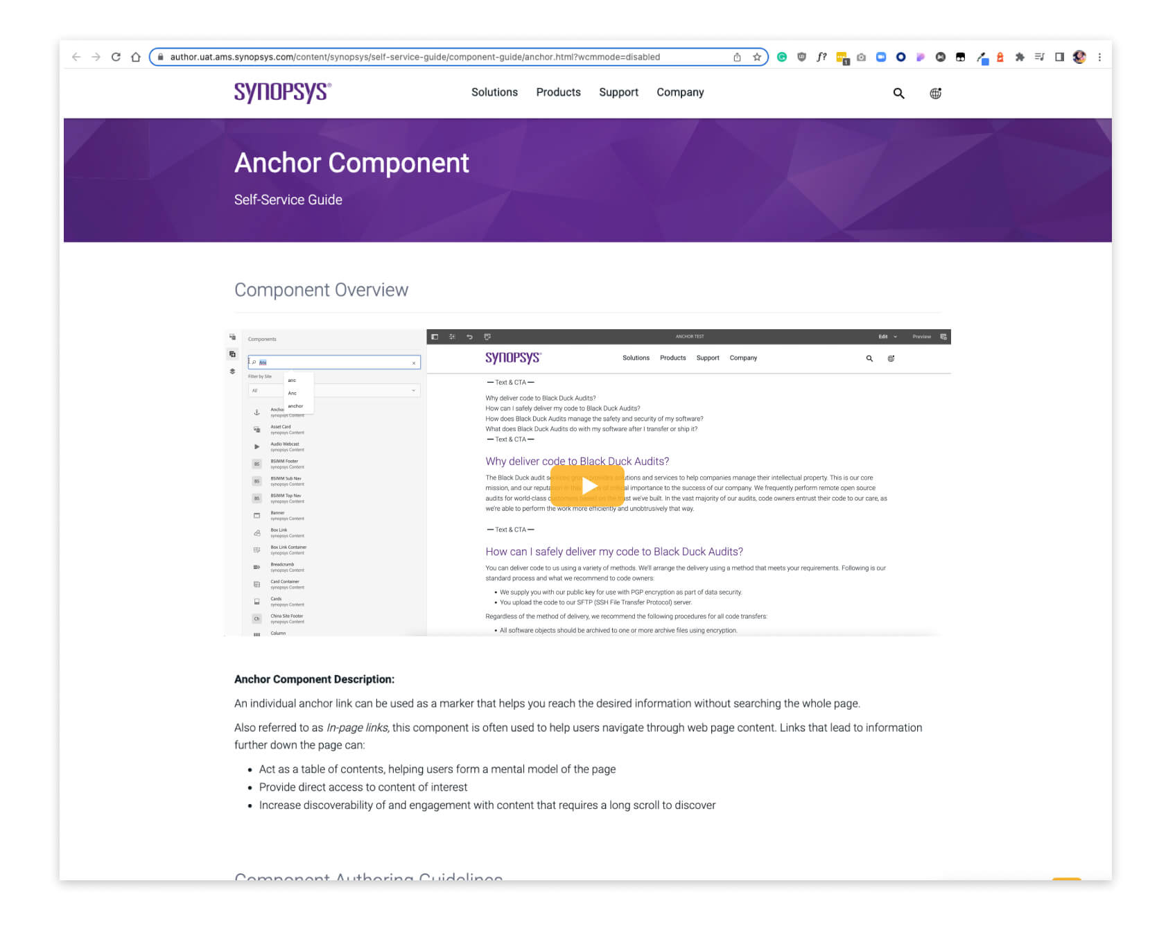
It will be helpful for the users to learn how to use this component, either long-term or beginner users.
Instead of reading the documentation, the users like the video more. Video saves time and teaches how to build a section with the component from beginning to end.
The users may forget to check the links, spellings, SEO, accessibility, image sizes, how it looks on different devices, and many details. I noticed those problems when I did testing with those pages. The step will remind the page authors to check the page details before publishing.
The first checklist UI proposal I made
The scond option from Dev team - Siteimprove Plugin
This is the plan for the work process.
01.
Define page strategy & components
02.
Define layouts order with right components
03.
Define the fragment components
04.
Start to build the page template
05.
Testing
06.
Launch
Strategy of content

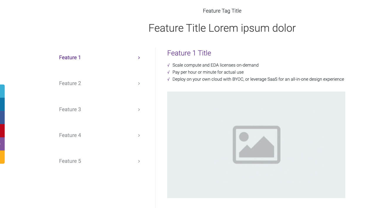
Posible components list
Layouts
Experience Fragments
If an author wants to re-use parts (a fragment of an experience) of a page, they need to copy and paste that fragment. Creating and maintaining these copy/paste experiences is time-consuming and prone to user errors. Experience Fragments eliminate the need for copy/paste.
Table of Content will help users jump to the target information, and the Process Bar will remind them how much content for the rest of the page.
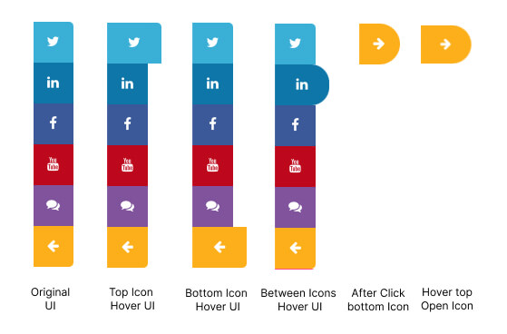
Social Share can scroll with the page. It helps the users jump to the contact us section and share the page link on social media.
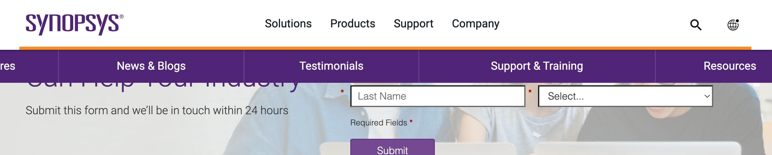
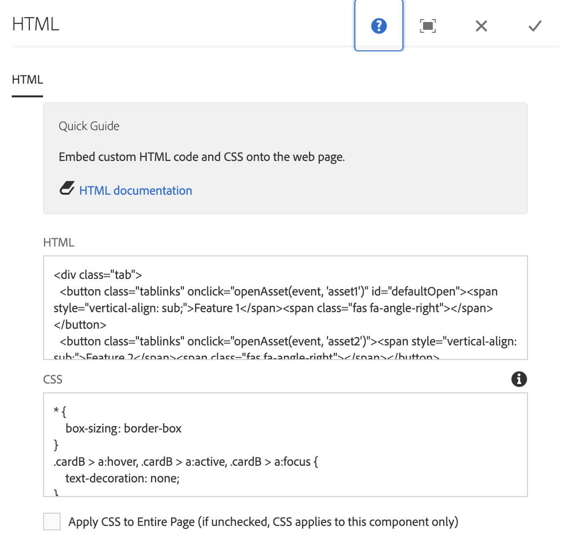
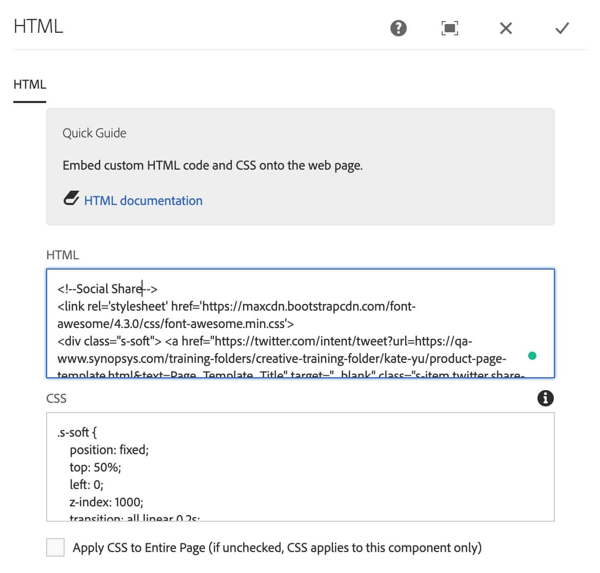
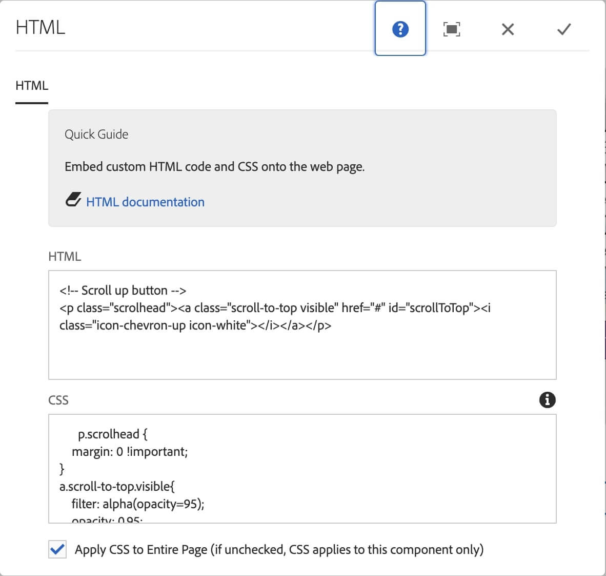
There are several sections using HTML component(customer code). They need to convert to components for the page authors without a tech background.

Original UI

Hover & Active UI
Original Code
Process Bar In Process UI
Process Bar End UI
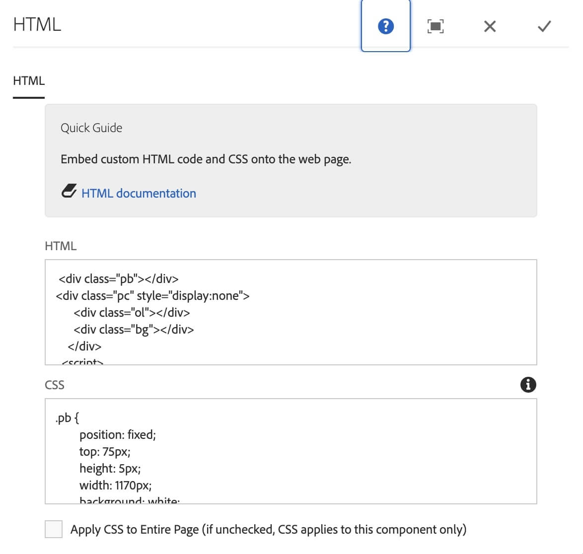
Original Code
Reponsive Web UI
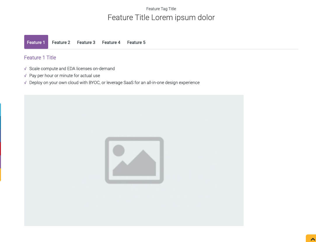
Tablet & Mobile UI
Original Code
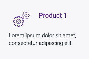
Original UI
Hover Effect UI
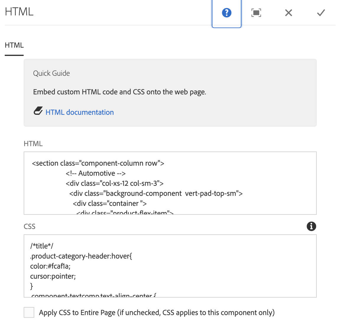
Original Code
This section works with Marketo. I added a customer CSS code on Marketo and a customer code with HTML component.

Responsive Web UI
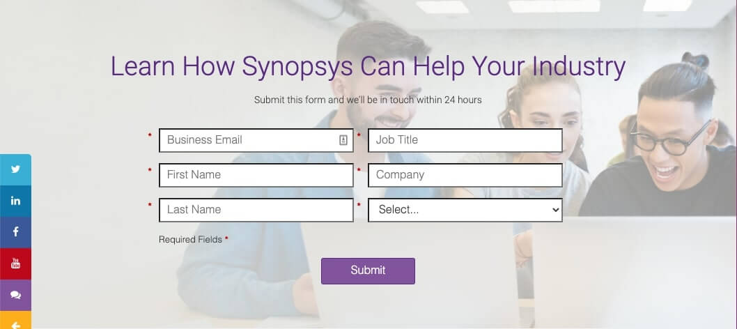
Tablet UI
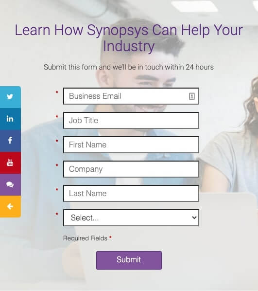
Mobile UI
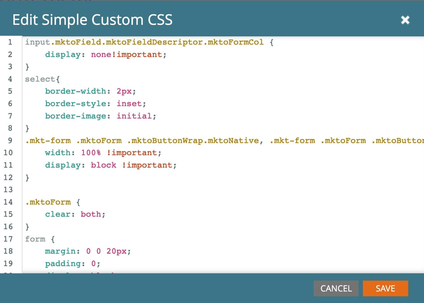
Marketo customer Code
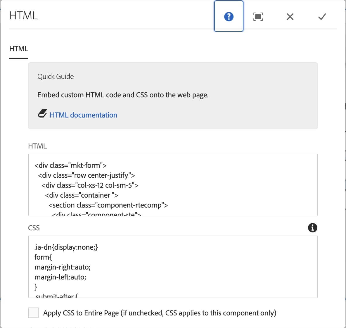
Original AEM Code
Original UI
Original Code

Responsive Web & Tablet UI

Mobile UI
Original Code
The product template page has been published for Q/A with Page Authors and the entire marketing team.
It only can be checked by the internal employees with a VPN connection.
This project lasted about two months. I took the ownership and leadership on this project while working with the marketing team, the engineering team, and another UX designer. I read the survey carefully and brought many questions based on their surveys during the interview meetings. I quickly figured out the problem from their feedback and started looking for solutions. Talking to the users is the best and quickest way to understand their pain points.
Hearing what the users say about the product and the feedback is very useful.
Bring the solutions and follow up to present the key in and out of the team.
Think about multiple situations when creating a component.
Propose the solutions to experienced persons first and hear their thoughts before working on them.