A design system, like the BN Design System created by the BN Framework team, streamlines design at scale by minimizing redundancy and ensuring visual consistency. The LOB Design Framework team focused on Line of Business, acts as a crucial bridge between central design and product design teams, enhancing collaboration and success. The BN Framework team, specializing in patterns and accessibility, ensures unique business requirements are integrated into the broader design framework, benefiting both teams.
Tool Used


Period
On Going
07/31/2022 - Present
Target Audience
Central Design Team
LOB Design Team
Participation
BN Framework Team
Kate Yu | Guohong Dong
What I am facing when I plan to create a design system that is simple, scalable, and understandable by designers and developers?
01.
Establish effective communication and collaboration among multiple design teams
02.
Foster cross-team collaboration for product designers to enhance overall efficiency
03.
Develop versatile design patterns for different use cases and variations
04.
Ensure compatibility of the Design System with various development systems
05.
Redesign and update old components to align with new themes
06.
Strike a balance between design consistency and creative expression
01.
Ensuring Consistency Across LOB Products
02.
Facilitating Efficient Collaboration
03.
Adapting to Unique LOB Requirements
04.
Optimizing User Experience for LOB Customers
05.
Streamlining Design Processes
06.
Adhering to Accessibility Standard to Widen Audience Reach

Duty to Central Team (Workstream)
Collaboration Model & Process
Base components and patterns
Component Design Ownership
Documentation Platform
Definition of Design System
Tooling (e.g. managing Figma files)
Mission to LOB Team
Bridge between central team updates and BN design team
Collaborate with central team to clarify uncertainties
Engage individual product designers to resolve common UX issues
Create and Maintain BN shared components: like guided step
01.
Inconsistency in Design
02.
Lack of Efficiency
03.
Increased Development Time
04.
Difficulty in Scaling
05.
Reduced UX Quality
06.
Limited Adaptability
07.
Higher Maintenance Burden
08.
Decreased Collaboration
Throughout a project's lifecycle, framework designers engage in research, study central design guidelines to balance flexibility and LOB limitations, collect existing use cases, conduct surveys and votes, host meetings with designers for input, and summarize outcomes for the BN Design Library. The process concludes with the creation of a documentation page on the Wiki.

Received a Request
BN UX Open Topic

Sign Work
Status Sheet
Work File
Share
BN Library

Summary
Documentation

Collaboration
Align with the Central Team
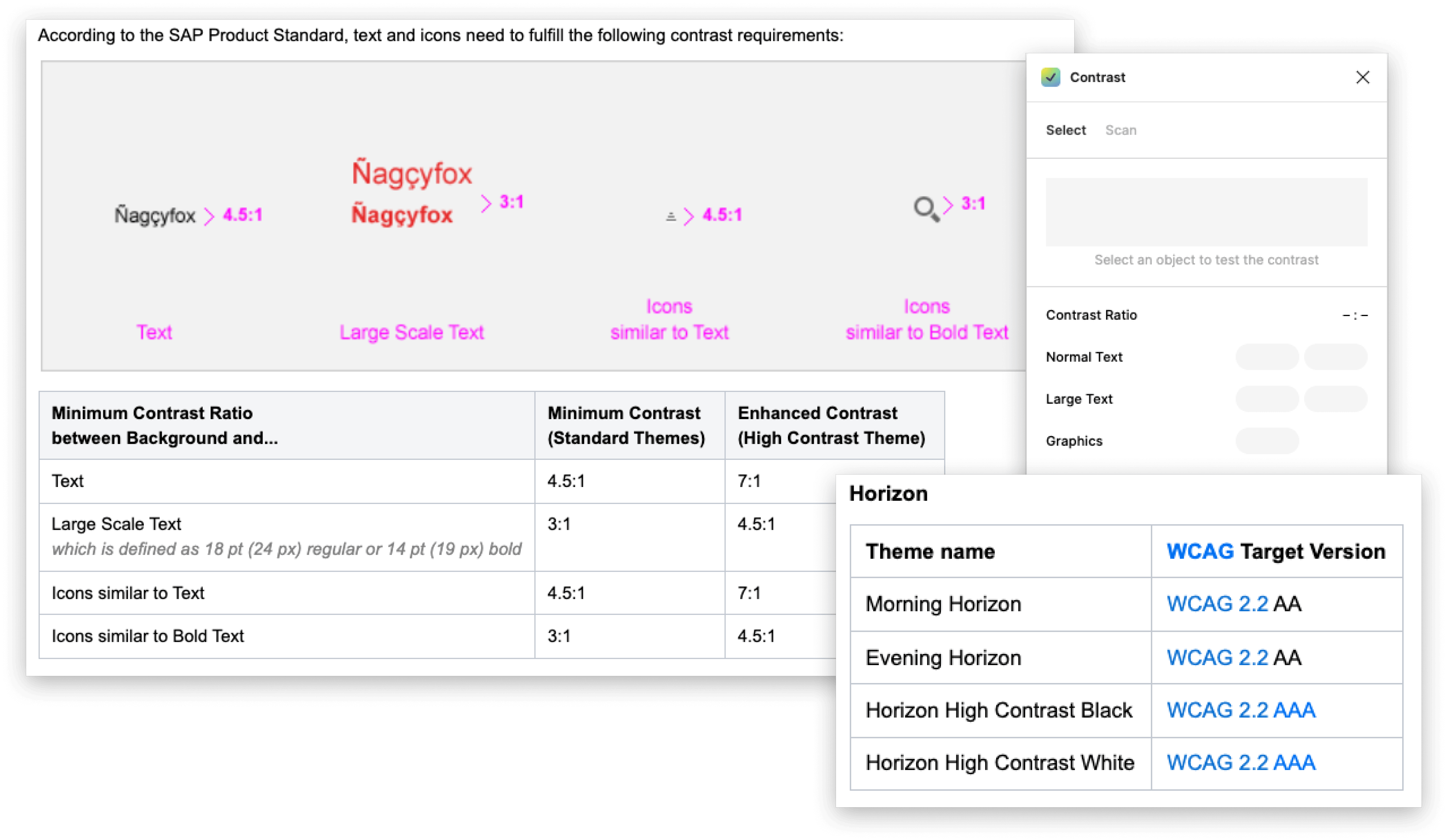
Design foundations describe the rationale behind the design system and how the design system has been constructed. This includes interaction design aspects, such as scrolling, as well as aspects of the design language like theming, iconography or motion design but also other aspects like tone of voice, accessibility and so on.
Accessibility refers to the possibility for everyone to access and use technology and information products. Everyone must be able to access products with the same level of efficiency and satisfaction.
Designers can make sure that all user interface elements are self-descriptive; information is communicated in a way that can be perceived by using sensory cues and structured descriptions; all functions can be efficiently accessed by keyboard or alternative assistive technologies; and, that the user interface is consistent, predictable, and avoids unexpected or distracting animations.
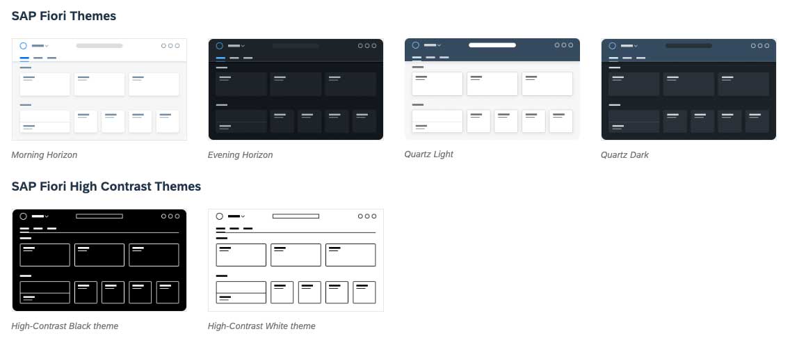
A theme specifies the concrete color palette, icon library, illustration library, font, grid / metrics, interaction sounds, motion, shadows, focus visualization, tone of voice, and shapes e.g., “roundness of corners”) for UI components.
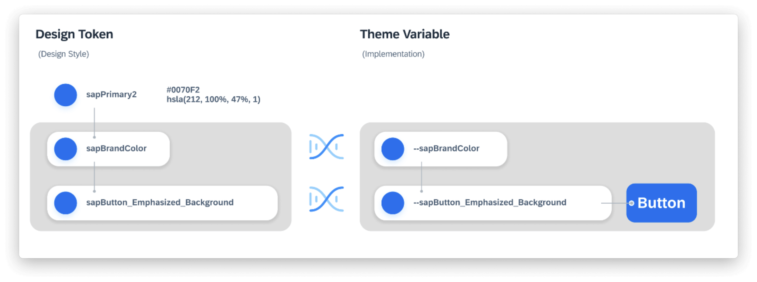
Design tokens are a way to specify elements of the design language so that they can be used across multiple steps in the design-to-development toolchain.
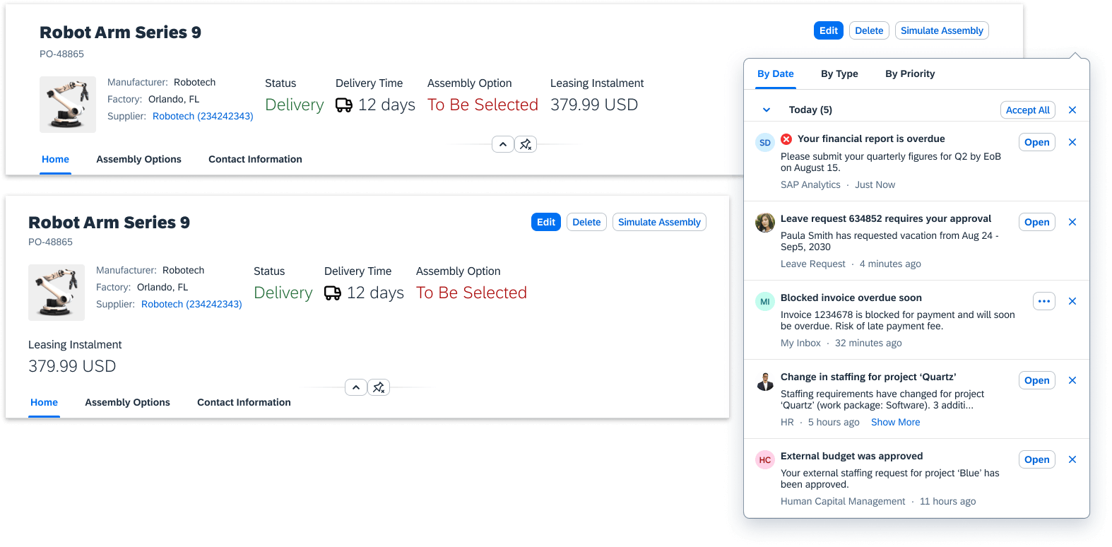
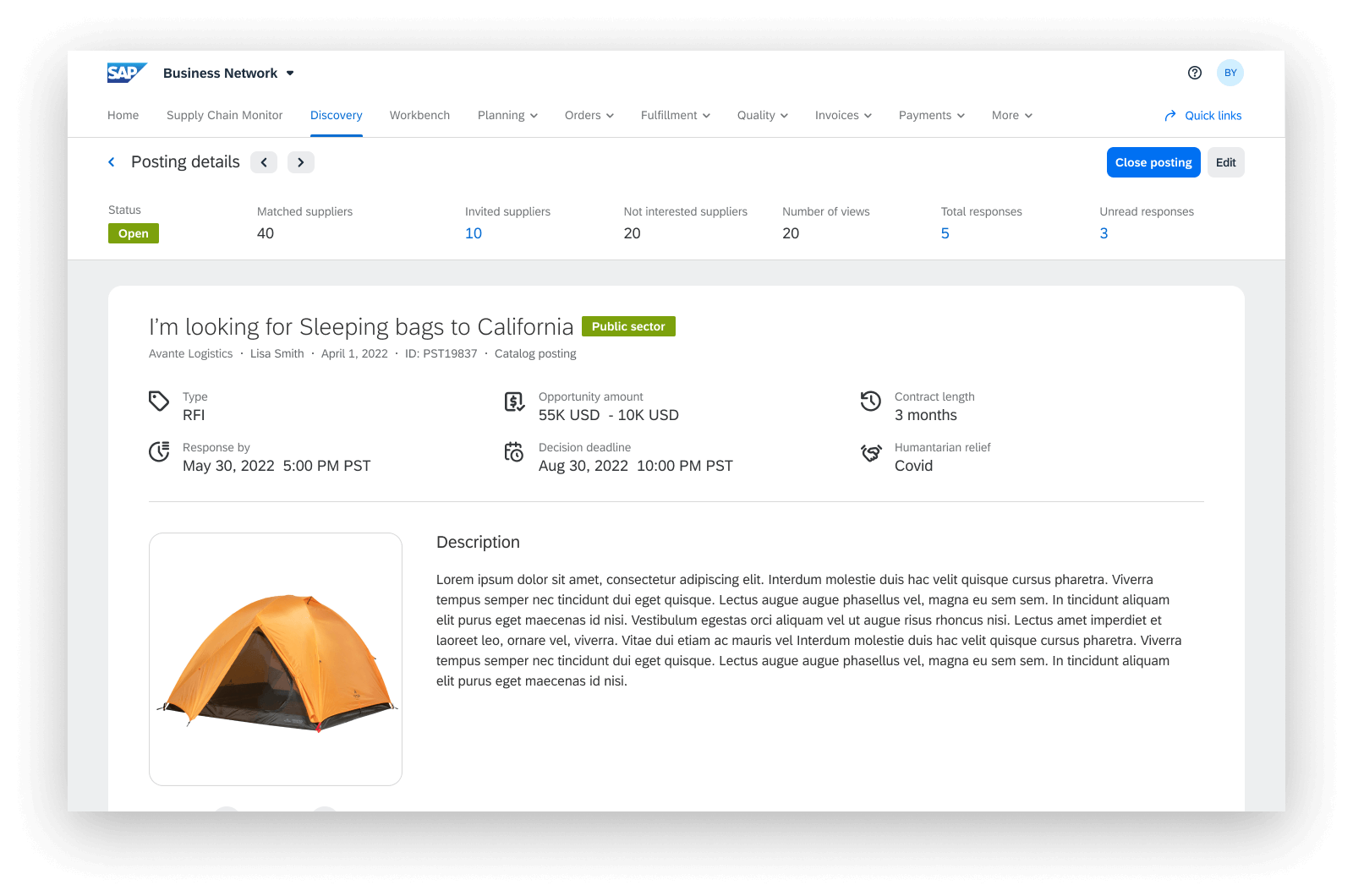
A component is a reusable building block, also known as a UI element, for creating a user interface. Examples for components are a button, an input field, or a list. Components are used by the designer to offer functionality that is needed to accomplish a task to the user. A user interface consists out of a combination of components that support a user flow.
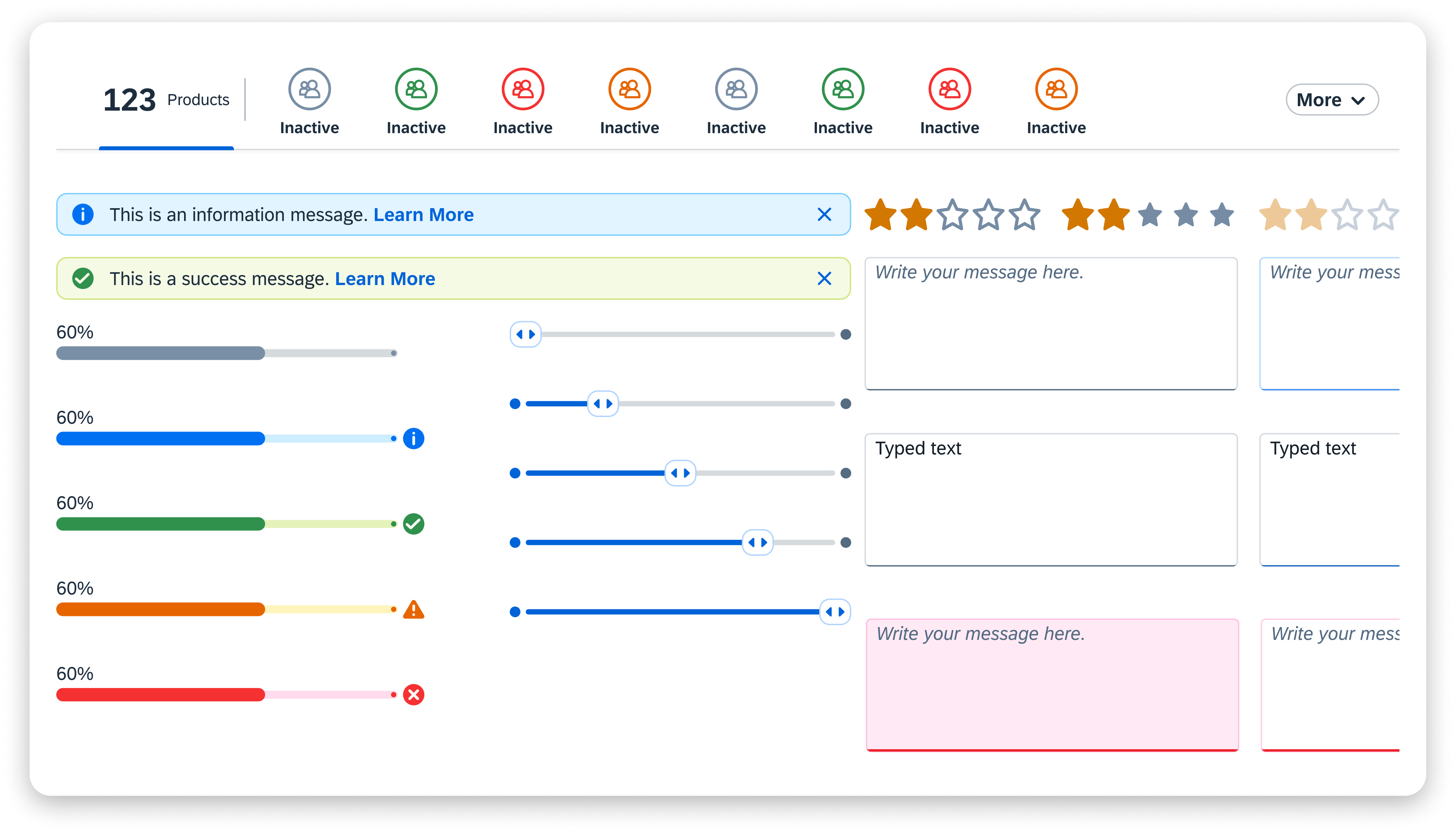
A pattern is a composition of components along with possible user interactions to cover specific, smaller common use cases. Patterns are (proven) solutions that are to be reused by application designers. They foster consistent experiences across applications, reduce users’ learning curve, and allow application designers to tackle unsolved design challenges.
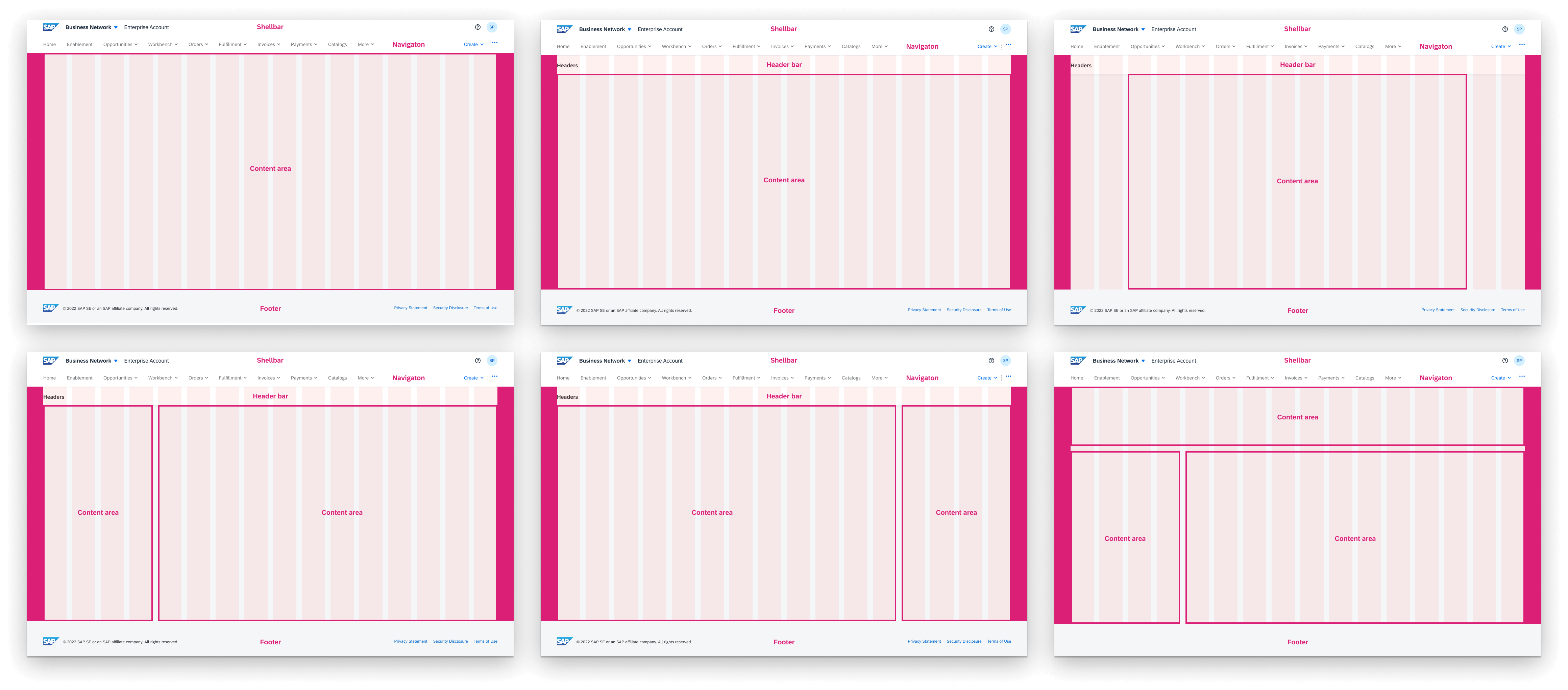
A floorplan is a composition of smaller UI parts, such as patterns and components. A floorplan describes a UI layout consisting of patterns and components which covers a frequently occurring use case. Typically, floorplans describe the content of a complete page or even spans several pages. Floorplans are meant to be reused by application designers.
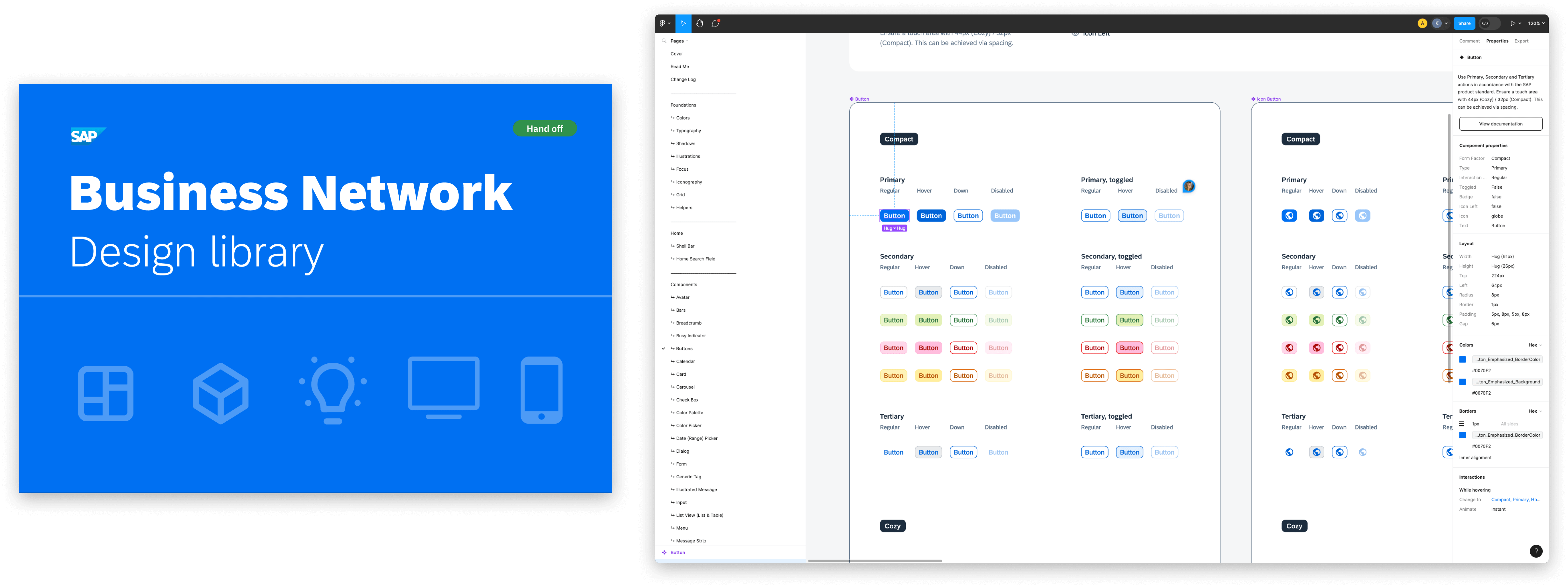
A UI kit consists of reusable components in design tools, such as Figma, Sketch, or Axure.
UI kits are usually provided in bundles as collections (also referred to as stencil sets, UI kits, or Figma/Sketch libraries). Being available in either low or high fidelity, UI kits speed up the production of design artifacts such as low-fidelity wireframes or high-fidelity mockups.
The design system is a work in progress, undergoing continuous iterations. The recently implemented components have notably enhanced the overall consistency and efficiency of product design work. I observed this improvement firsthand while the product designers were working on various features.
01.
Reduced time investment in coding new components
02.
Increased efficiency in the handoff process, requiring less explanation for element descriptions
03.
Minimized back-and-forth exchanges during Quality Assurance (QA)
04.
Enhanced consistency in the coded design
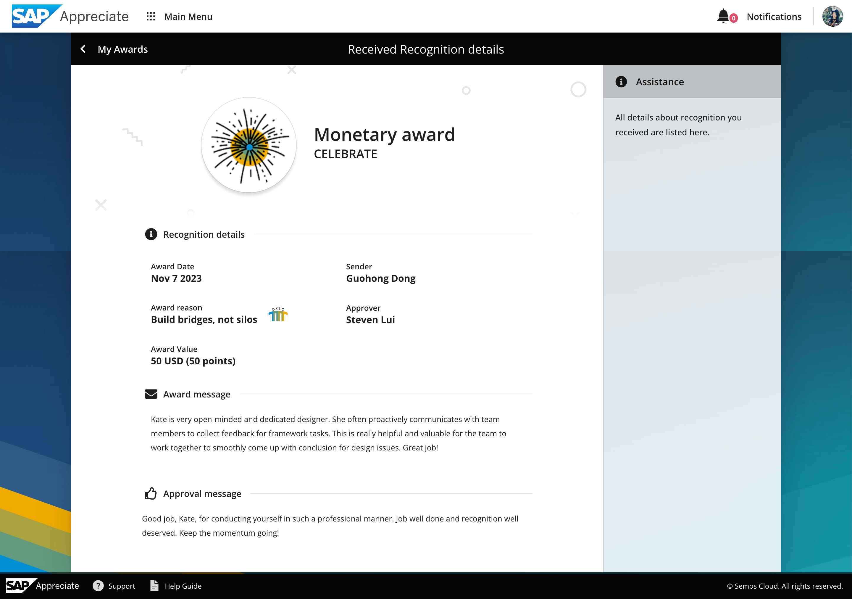
I recieved the Monetary award at Nov 7 2023.
As the design system grows, I want to make standardized pieces that can be used in different ways. I'll break down and document components for developers using frameworks like Bootstrap. As our design team gets bigger, I'll gather feedback on how the system helps or how we can make it better for them. Once the design system is in action, I'll check if it keeps everything looking the same. I'll survey the team to see how they use it every day and if it makes their work faster and better.